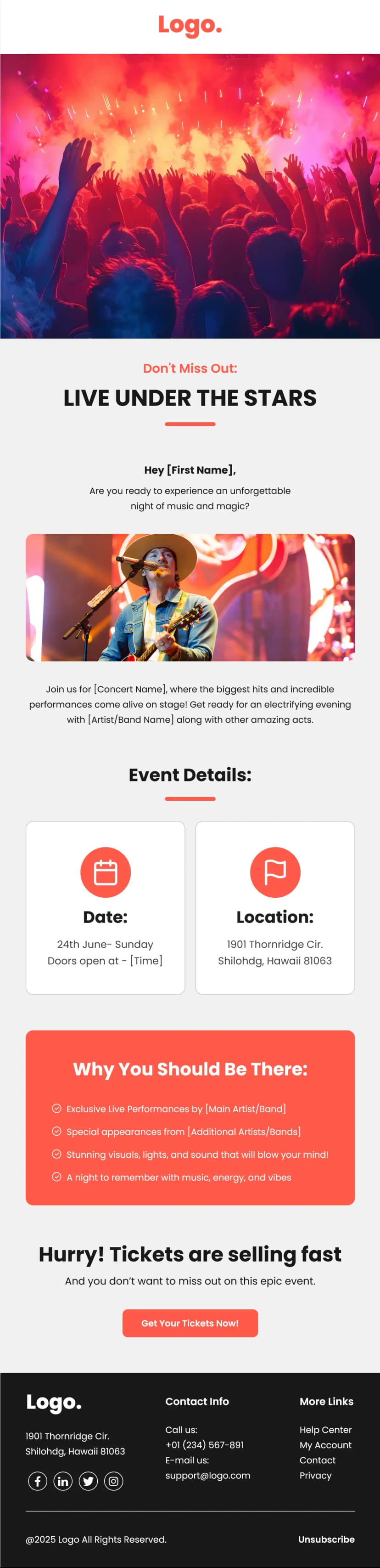


Fitness apps and gyms sell the same four things to everyone: convenience, results, coaching, and progress. What separates a converting email from an ignored one is how fast those four ideas land. This gym and workout email template gets each of them across in a single scroll using oversized type, alternating lime and charcoal panels, and almost no paragraphs. One idea per block, one image per block, and a bright yellow CTA that never changes color so it stays instantly recognizable from top to bottom. Built for gyms and fitness studios, workout and training apps, online coaching platforms, personal trainers, and wellness brands running trial or membership campaigns.
What's Inside This Gym & Workout Email Template
The header keeps it minimal with a heavy black wordmark centered on white, followed by a cream nav bar carrying two links for workouts and nutrition. Two links only. That restraint is deliberate, because a fitness email with eight nav items forces a decision before the reader has any reason to make one.
The hero sits on warm beige with an enormous two-line all-caps headline that takes up most of the screen. Below it, a rounded photo of someone training outdoors, three lines of centered copy, and a yellow pill CTA with a circular arrow icon offering a trial period. The beige background is what makes that yellow button work. Against white it would be washed out, but against a warm neutral it reads as the single brightest point in the entire section.
Then the template moves into its signature rhythm, three alternating full-bleed panels that swap between lime green and dark charcoal. Each one pairs a rounded image with a small bold eyebrow line and a large statement of benefit set in heavy type. Train from anywhere, real member results, expert coaching. Image left, image right, image left.
What makes these blocks effective is the type hierarchy. The eyebrow is small and quiet, the benefit is enormous, and there is no body copy underneath at all. A reader scrolling at speed absorbs three complete selling points without slowing down, which is exactly how people read fitness emails on a phone between sets or on a commute.
The alternating color panels do the other half of the work. Lime, charcoal, lime creates hard visual breaks that make each claim register separately instead of merging into one long argument. It also keeps a fairly long email from feeling long.
The final section is the most content-dense and shifts register completely. On charcoal, an icon sits above a year-in-review heading, followed by an intro line, five checkmark bullets covering product updates and recognition, and a closing forward-looking sentence. Several bullets carry inline yellow underlined links, which turn a recap into a set of navigation paths without adding a single extra button. A yellow pill CTA closes the section.
The footer is deliberately plain. Wordmark, mailing address, and an unsubscribe line. Nothing competing with the CTA sitting directly above it.
Use Cases
- Gym and fitness studio membership campaigns
- Workout and training app promotions
- Trial offer and signup conversion emails
- Online coaching and personal trainer marketing
- Member success story and community features
- Year in review and product update newsletters
- Wellness brand feature announcements
- Re-engagement campaigns for lapsed members
Why Use a Gym & Workout Email Template
Fitness marketing has an attention problem that most categories do not. Your reader has almost certainly tried and quit something similar before, which means they open your email already carrying doubt. Long persuasive copy makes that worse, because it reads as an attempt to overcome an objection they have not voiced yet. Short, confident statements work better, and this gym and workout email template is built entirely around that principle.
The one-idea-per-panel structure is the core of it. Three blocks, three claims, no paragraphs. A reader can absorb the entire value proposition in under ten seconds, and anyone who wants detail clicks the trial button. Fitness brands that pack specifications, class schedules, and pricing tables into the same email consistently see lower click rates, because the reader stalls out trying to process it all.
Keeping the CTA a single consistent color across the whole email matters more than it sounds. Yellow appears nowhere else except the buttons and the inline links, which means a reader scrolling fast can spot the action without reading anything. When accent colors show up in headings and backgrounds too, that shortcut disappears.
The member story block is the most persuasive section for a specific reason. Prospects do not doubt that your product works, they doubt that it will work for them. A named individual with a real timeline answers that in a way no feature list can. Worth noting that this section should always celebrate the person rather than prescribe an outcome, since a story that reads as a promise sets an expectation you cannot control.
And the year-in-review section at the bottom is the retention half of the email. Every block above it is aimed at conversion, but the recap speaks to existing members, showing that the product has improved since they joined. Bundling acquisition and retention into one send is efficient, and placing the retention content last means it never gets in the way of the trial CTA.
How to Customize This Template
Open this gym and workout email template in Maileditor and start with the palette. The lime, charcoal, and yellow combination is doing a lot of the personality work, but any high-energy accent will hold up as long as you keep two rules. Alternate a bright panel with a dark one, and reserve the CTA color for buttons and links only.
Drop your logo into the header and trim the nav to the two or three destinations you actually want traffic on. Rewrite the hero headline as a short, punchy statement and keep it to two lines, because the scale of that type is the entire design.
Update the trial CTA with your real offer, whether that is a trial period, an introductory class, a consultation, or a discounted first month. Replace the hero photo with your own space or your own members. Real environments outperform stock gym photography, since prospects are deciding whether they would feel comfortable there.
Rewrite the three alternating panels around your strongest three claims, keeping each to one eyebrow line and one large sentence. Session counts, trainer credentials, class variety, equipment, app features, and location access all work well here. If a claim needs a paragraph to explain, it belongs on a landing page rather than in this email.
Swap the member story for a real one from your own community, with permission, and frame it around how the person feels and what they can now do rather than around numbers alone. Supportive framing performs better and it keeps the email welcoming to readers at every stage of their journey.
Rebuild the recap bullets around your own updates, awards, or features, keeping the inline links since they add navigation without extra buttons. Point the closing CTA at your blog, resource hub, or app, then update the footer with your business name, address, and unsubscribe link. The layout is fully responsive across all major email clients, and once it looks right, export it easily to your preferred email service platform like Mailchimp, Klaviyo, Omnisend, or HubSpot. No coding needed.