Why Emails Look Different in Every Inbox and How to Fix It
Emails look different in every inbox because Gmail, Outlook, Apple Mail, and mobile apps support HTML, CSS, fonts, images, and dark mode differently

Md. Yaikub Hossain Razon
Emails look different in every inbox because email clients use different rendering engines, support different HTML and CSS features, apply their own security rules, and modify designs for screen size, fonts, image settings, and dark mode.
An email that looks correct in Gmail may have different spacing in Outlook, a replaced font in another inbox, resized images on mobile, or changed colors in dark mode.
To reduce these inconsistencies:
- Build emails with email-safe HTML rather than webpage code.
- Use table-based structures for important layouts.
- Apply critical styles inline.
- Add fallback fonts, colors, and button treatments.
- Keep the design responsive and relatively simple.
- Test the final delivered email in the inboxes your audience uses.
The goal is not to make every email mathematically identical in every client. The goal is to preserve the message, hierarchy, branding, links, and primary call to action everywhere.
Why Does the Same Email Look Different in Every Inbox?
An HTML email is not displayed by one universal system.
Recipients may open the same campaign in:
- Gmail on desktop
- Gmail on Android
- Gmail on iPhone
- Classic Outlook for Windows
- New Outlook
- Outlook on the web
- Outlook for Mac
- Apple Mail
- Yahoo Mail
- Samsung Email
- A company’s internal mail application
Each environment decides how to interpret the HTML, which CSS to support, whether to load images, and how to adapt the message to the device.
That is why email rendering is less like publishing one webpage and more like asking several different applications to reconstruct the same design.
What Are Email Rendering Differences?
Email rendering differences are visual or functional changes that occur when the same HTML email is displayed in different email clients.
Common differences include:
- Changed spacing
- Misaligned columns
- Replaced fonts
- Missing background images
- Square instead of rounded buttons
- Oversized or undersized images
- Different line wrapping
- Changed colors in dark mode
- Hidden content
- Stacked desktop columns on mobile
- Buttons that become difficult to tap
- Sections that appear wider than the screen
Some differences are minor and acceptable. A substituted font or slightly different corner radius may not damage the message.
A rendering problem becomes serious when it affects:
- Readability
- Navigation
- Brand recognition
- The offer
- The CTA
- Accessibility
- The recipient’s ability to complete an action
1. Email Clients Use Different Rendering Engines
The rendering engine is the system an email client uses to interpret HTML and CSS.
Different engines support different features and may calculate layout, spacing, fonts, and dimensions differently.
Classic Outlook uses Microsoft Word
Classic Outlook for Windows uses a Word-based rendering engine for HTML email. Microsoft documents that this environment can produce issues involving padding, line height, background images, text wrapping, and other layout properties
This is why an email built like a modern website may break in Classic Outlook.
Features that commonly require special care include:
- CSS background images
- Margins and padding
- Rounded buttons
- Column layouts
- Image sizing
- Line height
- Modern CSS positioning
New Outlook uses a different environment
New Outlook and Classic Outlook do not use the same rendering approach. Microsoft support discussions continue to document differences in table width, alignment, spacing, and typography between the two versions.
Testing only New Outlook does not prove that an email will display correctly in Classic Outlook.
Gmail has its own CSS rules
Gmail supports inline styles, <style> blocks, many standard CSS properties, selectors, and media queries. However, unsupported properties or selectors may be ignored.
The Gmail desktop experience, Gmail mobile apps, and Gmail accounts displaying mail from non-Google providers can also behave differently in certain situations.
Apple Mail generally supports more modern CSS
Apple Mail uses WebKit-based rendering and supports many modern design techniques. However, a design that works in Apple Mail may still fail in a less capable client.
Apple Mail also responds to system appearance settings, including dark mode, which can change how backgrounds, text, and images appear.
Email Client Rendering Comparison
| Email environment | General rendering approach | Common concerns |
|---|---|---|
| Classic Outlook for Windows | Microsoft Word-based | Spacing, backgrounds, buttons, columns and modern CSS |
| New Outlook | Modern web-based environment | May differ from Classic Outlook |
| Gmail | Web-based with Gmail CSS rules | Unsupported CSS may be ignored |
| Apple Mail | WebKit-based | Strong CSS support, but dark mode and device differences remain |
| Yahoo and other webmail clients | Client-specific web rendering | Style filtering and uneven feature support |
| Mobile applications | Client engine plus small screen | Stacking, font scaling, image width and touch targets |
This table describes general tendencies, not guarantees. Support changes by application, version, account type, operating system, and device.
2. HTML Email Does Not Support CSS Like a Website
A common cause of broken email is using code designed for browsers.
Modern websites often depend on:
- Flexbox
- CSS Grid
- JavaScript
- Absolute positioning
- External stylesheets
- Complex selectors
- Web applications
- Hover-dependent interactions
- Advanced animation
- Dynamic browser APIs
Email clients do not support these features consistently.
For example, support data maintained by Can I Email shows that CSS Grid, Flexbox-related properties, web fonts, background images, and other modern features vary considerably across tested email clients.
A technique may work in several current inboxes while failing in older Outlook versions or a less common mobile client.
Build for the weakest important client
You do not need to support every old inbox ever created.
Identify the clients your subscribers actually use, then make sure essential content works in the least capable important environment.
Advanced effects can still be added as progressive enhancements. The email must remain readable and actionable without them.
3. Email Clients May Ignore or Modify CSS
Email services inspect incoming HTML to protect users and maintain their interfaces.
As part of that process, a client may:
- Ignore an unsupported property
- Remove an unsupported element
- alter a style declaration
- Replace a font
- Change a default margin
- Transform colors
- Prevent scripts from running
- Restructure some markup
Gmail’s official CSS documentation explicitly notes that unsupported properties and selectors may be ignored.
This means valid browser CSS is not automatically reliable email CSS.
4. Fonts Are Not Available Everywhere
A custom font only appears when the email client supports the loading method and can access the font file.
Web-font support is limited and inconsistent. Can I Email’s support data for @font-face shows major differences across Gmail, Outlook, Apple Mail, and other clients.
When the custom font is unavailable, the inbox uses a fallback.
That replacement can change:
- Line length
- Headline wrapping
- Button width
- Paragraph height
- Spacing around text
- The overall height of a section
How to fix font differences
Use a clear fallback stack:
font-family: Arial, Helvetica, sans-serif;
or:
font-family: Georgia, "Times New Roman", serif;
A branded web font can appear first, but the design should remain usable when a fallback appears.
Do not make a button so narrow that a slightly wider fallback font forces the text onto two lines.
5. Screen Size Changes the Layout
Desktop and mobile inboxes do not provide the same amount of space.
A multi-column layout that fits comfortably on a desktop may:
- Stack vertically
- Become compressed
- Overflow horizontally
- Shrink images
- Wrap headings onto additional lines
- Push the CTA farther down the message
Responsive email design uses fluid widths, mobile-friendly structures, and media queries to adapt the layout.
However, media-query support is not completely uniform. Can I Email maintains separate support data for media queries because behavior varies among clients and versions.
How to fix mobile inconsistencies
- Use a mobile-first content hierarchy.
- Keep the main container fluid within a sensible maximum width.
- Make images responsive.
- Allow columns to stack.
- Avoid fixed-width content that exceeds small screens.
- Use readable text without requiring zoom.
- Make buttons large enough to tap.
- Keep important content near the beginning.
Read MailEditor’s guide to mobile-responsive email design for a more detailed mobile workflow.
6. Dark Mode Can Change the Colors
Dark mode is not implemented consistently across email clients.
An inbox may:
- Leave the email unchanged
- Replace light backgrounds with dark backgrounds
- Invert text colors
- Partially transform the design
- Preserve some brand colors
- Change only selected sections
- Apply different rules to images and HTML elements
Support for CSS controls such as color-scheme remains limited across email clients, so senders cannot fully control every dark-mode transformation.
Common dark-mode problems
-
A dark logo disappears against a dark background.
-
White icons disappear when placed on a transformed light area.
-
Text and background become too similar.
-
Images retain white boxes around them.
-
A button loses contrast.
-
Brand colors change unexpectedly.
How to fix dark-mode problems
- Test both light and dark appearances.
- Give dark logos a light outline or controlled background.
- Avoid essential text inside images.
- Use transparent images carefully.
- Maintain strong text contrast.
- Provide solid fallback colors.
- Avoid placing dark text on transparent backgrounds.
- Use supported dark-mode CSS as an enhancement, not the only solution.
MailEditor’s guide to common email design mistakes covers disappearing logos, visible image boxes, and unreadable dark-mode combinations.
7. Images May Be Blocked, Resized, or Displayed Differently
Email clients and user settings may prevent remote images from loading automatically.
When an image is blocked:
- A hero section may become empty.
- Text placed inside the image disappears.
- The CTA may lose context.
- Image-based spacing can collapse.
- The logo may not appear.
Images can also display differently when the code does not define suitable dimensions.
How to make images more reliable
- Use actual
<img>elements for important images. - Include a suitable width.
- Use a responsive
max-widthtreatment where appropriate. - Set the height to adjust proportionally.
- Add meaningful alt text.
- Compress large files.
- Host images on stable HTTPS URLs.
- Keep essential information as live text.
- Provide background-color fallbacks.
Do not make the entire email one image. The message should remain understandable when images are unavailable.
8. Background Images Are Not Universally Reliable
A background image can display correctly in Gmail or Apple Mail and disappear in some Outlook environments.
Support varies by client, as shown in the current background-image compatibility data maintained by Can I Email. (caniemail.com)
Classic Outlook commonly requires VML fallback code when a background image is essential. Microsoft also notes that Outlook background-image handling can require predetermined section dimensions, which becomes more difficult with dynamic content. (learn.microsoft.com)
How to fix background-image problems
- Add a solid fallback color.
- Keep important text as live HTML.
- Maintain readable contrast without the image.
- Use tested VML fallback code for relevant Outlook versions.
- Avoid essential information that depends on the background.
- Test personalized sections at different content lengths.
A decorative background can disappear without damaging the email. A background carrying the entire message cannot.
9. Buttons Render Differently
A website-style link with padding, background color, and rounded corners may not behave like a stable email button in every inbox.
Possible problems include:
- Padding disappearing
- Border radius being ignored
- Button width changing
- Text wrapping
- Only the text being clickable
- The background failing in Outlook
How to build safer email buttons
Use a table-based button or a tested bulletproof-button pattern.
The button should have:
- A clear fallback background color
- Sufficient text contrast
- Generous clickable space
- A destination link around the intended clickable area
- Enough width for fallback fonts
- Outlook-specific treatment when required
Do not depend on rounded corners to make the element recognizable as a button.
10. Spacing Is Calculated Differently
Margins, padding, line height, and empty table cells can behave differently across clients.
Classic Outlook is particularly sensitive to spacing techniques. Microsoft recommends applying critical spacing to table cells when troubleshooting HTML email layouts.
How to fix inconsistent spacing
- Apply important padding to
<td>elements. - Reset default paragraph margins.
- Set explicit line heights.
- Avoid using empty paragraphs as spacers.
- Use tested spacer rows when necessary.
- Remove unnecessary nested containers.
- Check whether the sending platform adds its own styles.
Small spacing differences are often acceptable. Fix them when they damage hierarchy, alignment, or readability.
11. Your Sending Platform May Change the Code
The email can look correct in the editor and break after it enters an ESP, CRM, automation tool, or Outlook workflow.
The platform may:
- Add tracking parameters
- Wrap links
- Add identifying attributes
- Process template variables
- Move styles
- Remove unsupported markup
- Rewrite image URLs
- Insert unsubscribe content
- Add a preview-text block
That is why testing the source HTML alone is not enough.
Test the version that has passed through the actual platform and delivery process.
Common Email Display Problems and Their Fixes
| Problem | Likely cause | Recommended fix |
|---|---|---|
| Columns overlap or collapse | Unsupported layout CSS | Use email-safe table or hybrid structures |
| Email is wider than the screen | Fixed-width content | Use fluid containers and responsive images |
| Button changes shape | Unsupported CSS or Outlook rendering | Use a table-based or bulletproof button |
| Background image disappears | Limited background-image support | Add a fallback color and Outlook VML |
| Font changes | Web font is unavailable | Define a web-safe fallback stack |
| Image is too large | Missing dimensions or responsive rules | Set width and responsive max-width |
| Logo disappears in dark mode | Insufficient separation | Add outline or controlled background |
| Text becomes unreadable | Color transformation or low contrast | Use stronger contrast and test dark mode |
| Spacing changes in Outlook | Margin or line-height interpretation | Apply critical spacing to table cells |
| Desktop columns stay narrow on mobile | Missing or unsupported responsive behavior | Use stackable structures with safe fallback |
| Content disappears with images blocked | Important text is inside images | Use live HTML text and alt text |
| Design changes after sending | ESP rewrites the HTML | Test through the real sending platform |
How to Fix an Email That Looks Broken
Use the following troubleshooting process instead of changing random styles.
Step 1: Identify the Exact Inbox
“Outlook” is not specific enough.
Record:
- Email application
- Application version
- Operating system
- Desktop, web, or mobile
- Light or dark mode
- Account provider
- Screen size
- Whether images are enabled
- Classic Outlook for Windows and Outlook on the web may display the same email differently.
Step 2: Reproduce the Problem
Send the same final email to an account opened in the affected environment.
Do not troubleshoot only from a screenshot when direct testing is possible.
A screenshot may hide:
- Whether a link works
- Whether content scrolls horizontally
- Whether the button is fully clickable
- Whether images were blocked
- Whether the user zoomed the interface
Step 3: Find the Smallest Broken Component
Identify whether the problem is limited to:
- One image
- One button
- One table row
- One column
- One text block
- One background
- One responsive rule
Isolating the component prevents unnecessary changes to the rest of the template.
Step 4: Check Feature Support
Search the relevant HTML element or CSS property in an email compatibility database such as Can I Email.
Do not assume browser support equals email support.
Step 5: Add a Safe Fallback
Examples include:
- Web-safe font after a custom font
- Solid color behind a background image
- Stacked mobile layout when media queries fail
- Table-based button when border-radius fails
- Live text when images are blocked
- Fixed Outlook width alongside a fluid modern-client width
The fallback should preserve meaning and action, even when the enhanced design is unavailable.
Step 6: Simplify the Structure
When a component continues to fail, remove unnecessary complexity.
Replace:
- Multiple nested containers with a simpler table
- Advanced positioning with normal document flow
- Browser-only layout methods with email-safe structures
- Several decorative layers with one reliable background
- A complex multi-column section with a stackable alternative
Reliability usually improves when the code becomes simpler.
Step 7: Retest Through the Real Workflow
Export the updated email, place it into the actual sending platform, and send a new test.
Do not assume that a corrected editor preview equals a corrected delivered email.
How to Prevent Email Rendering Problems
Fixing a broken campaign after launch is expensive. A controlled production process catches problems earlier.
1. Start With Email-Safe Templates
A tested email template provides a safer foundation than copying a webpage design.
MailEditor offers responsive HTML email templates for newsletters, ecommerce, onboarding, transactional messages, events, and other campaigns.
2. Use a Dedicated Email Editor
A webpage builder is optimized for browsers. An email editor is designed around the limitations of inboxes.
MailEditor’s drag-and-drop email editor lets teams edit layouts visually while working with email-oriented structures.
3. Import Existing HTML Carefully
Existing code may contain:
- Unsupported CSS
- Missing images
- Fixed desktop widths
- Broken links
- Unnecessary nested tables
- Styles added by another editor
- Browser-only elements
Use MailEditor’s Import and Edit workflow to bring existing HTML or ZIP files into a visual editor before updating the content and layout.
For a detailed process, read how to edit a custom HTML email template without coding.
4. Reuse Stable Modules
Repeatedly copying and modifying old campaigns can introduce hidden code changes.
Create tested modules for:
- Headers
- Hero sections
- Product cards
- Article rows
- Testimonials
- CTAs
- Footers
- Legal content
Reusing controlled components reduces the number of new elements that must be debugged in each campaign.
MailEditor’s guide to creating reusable email templates explains how to build a repeatable production system.
5. Keep Critical Styles Close to the Elements
Inline CSS remains a dependable approach for many essential email styles.
Use inline declarations for critical properties such as:
- Font family
- Font size
- Line height
- Text color
- Background color
- Width
- Padding
- Alignment
A <style> block can still support responsive and client-specific rules, but the email should not lose its basic readability when those rules are ignored.
6. Design for Graceful Degradation
Graceful degradation means the email may lose an enhancement without losing its purpose.
Examples include:
- A square button replacing a rounded one
- A solid color replacing a background image
- A fallback font replacing the branded font
- One stacked column replacing two side-by-side columns
- A static first frame replacing an animation
These differences are acceptable when the reader can still understand and use the email.
7. Test Early, Not Only Before Sending
Test the structure before filling the campaign with final content.
Then test again after:
- Replacing placeholder text
- Adding real images
- Adding tracking links
- Applying personalization
- Importing into the ESP
- Adding the footer
- Making last-minute edits
A long headline or personalized name can break a section that worked with short placeholder text.
8. Test the Inboxes Your Audience Uses
A sensible minimum test list often includes:
- Gmail desktop
- Gmail mobile
- Classic Outlook for Windows
- New Outlook or Outlook Web
- Apple Mail
- Relevant mobile devices
- Light mode
- Dark mode
Your actual list should reflect subscriber usage.
Use MailEditor’s email testing tool to send HTML tests to inboxes you control, and follow the complete guide to testing email templates across devices.
Email Rendering Pre-Send Checklist
Layout
- The main container fits desktop and mobile screens.
- Important structures use email-safe techniques.
- Columns stack correctly.
- Nothing scrolls horizontally.
- Spacing remains readable in Outlook.
- The footer does not become wider than the email.
Typography
- Every custom font has a fallback.
- Headlines work when the fallback is wider.
- Body text is readable on mobile.
- Line heights are set explicitly.
- Text contrast remains sufficient.
Images
- Images use stable HTTPS URLs.
- Important images have dimensions.
- Images scale on narrow screens.
- Alt text is present where useful.
- The email remains understandable when images are blocked.
- The logo works in light and dark mode.
Buttons and links
- The primary CTA is easy to find.
- The full intended button area is clickable.
- Button text does not wrap unexpectedly.
- Button colors remain readable.
- Every destination URL works.
- Text links remain identifiable.
Backgrounds and color
- Background images have fallback colors.
- Important text does not depend on an image.
- Light mode has been checked.
- Dark mode has been checked.
- Transparent logos remain visible.
- Colored sections retain sufficient contrast.
Delivery workflow
- The final ESP version has been tested.
- Personalization has been tested with short and long values.
- Tracking links have been added before the final test.
- Unsubscribe and preference links work.
- New messages, forwards, and replies have been reviewed where relevant.
Final Answer
Emails look different in every inbox because Gmail, Outlook, Apple Mail, mobile applications, and other clients do not interpret HTML and CSS through one shared rendering standard.
The most reliable fix is to:
- Use email-safe HTML structures.
- Apply critical CSS inline.
- Add fallback fonts, colors, and images.
- Design responsive layouts that can stack safely.
- Treat advanced effects as optional enhancements.
- Test the final delivered email in real inboxes.
Begin with a responsive MailEditor template, customize it in the drag-and-drop email editor, or import your existing HTML. Then send the completed design through the email testing tool before launching the campaign.
Popular Blogs
Email Design2 mins to read
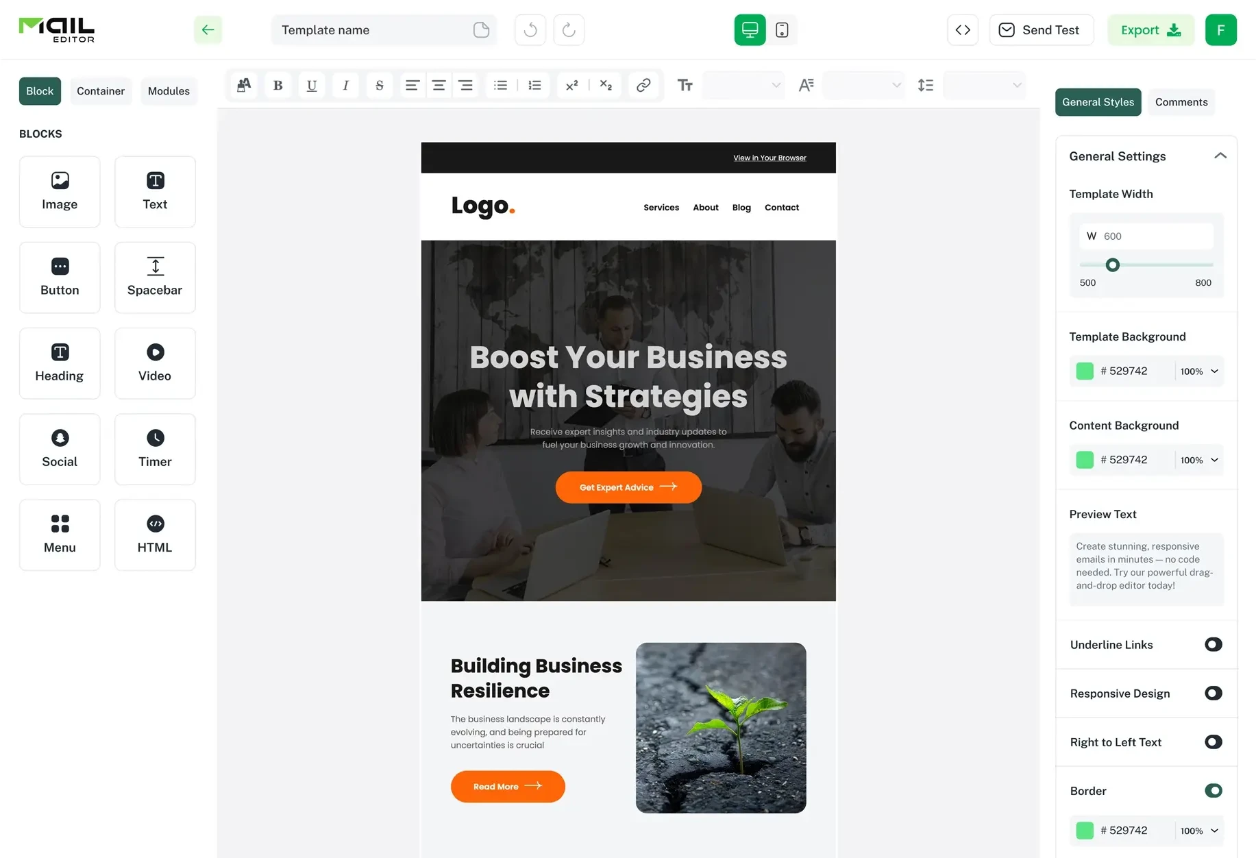
Top Email Template Builders & HTML Email Editors for 2026
Compare the best email template builders and HTML editors to design professional, responsive campaigns without coding.

Email Tips7 mins to read
Best Drag and Drop Email Editors in 2026
Discover the best drag and drop email editors in 2026. Compare top tools, features, templates, pricing, and automation to build stunning emails fast.
Email Design9 mins to read
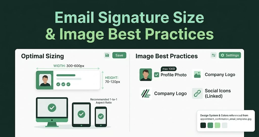
Email Signature Size and Image Best Practices
The ideal email signature is 320–600px wide and 90–200px high. Learn the best image sizes, formats, file limits, and mobile-friendly design tips.
Marketing7 mins to read
4 Best Unlayer Alternatives to Design Emails
Looking for Unlayer alternatives? Explore the 4 best email design tools to create beautiful, responsive emails faster and easier.
Marketing6 mins to read
5 Beefree Alternatives to Upgrade Email Design Workflows
Looking for a better email design tool? Explore 5 Beefree alternatives that streamline workflows, improve collaboration, and elevate email campaigns.