Avoiding Common Email Design Mistakes (The Ultimate Guide)
Avoid common email design mistakes that hurt opens and clicks. Learn how to improve layout, readability, and conversions with smarter, cleaner email design.

Shahin Alam
I still remember the night before my first holiday sale. Not in a dramatic way. I was just tired. Coffee was gone. Eyes hurt. Sitting there staring at my screen longer than I should’ve been.
I’d spent weeks on the offer, so I figured everything was fine. At the last minute I sent a test email to my phone. Just to be safe.
It wasn’t safe.
Images didn’t show up. The text was tiny for some reason. And the buy button… I don’t know where it went. It just wasn’t there.
That was the moment I realized something pretty obvious, but only after messing it up. A good offer doesn’t matter if the email itself doesn’t work.
That night stuck with me. Because when someone opens an email, they don’t think about your strategy or how long you worked on it. They just react. It either feels right or it doesn’t.
If it looks messy or broken or hard to read, people don’t give it a second chance. They close it. Sometimes they don’t open the next one at all.
Design isn’t about making things look nice. It’s more basic than that. It’s about not getting in the way. Letting the message come through without friction.
According to recent industry research, design has a major impact on how people interact with your brand.
| Metric | Well-Designed Emails | Poorly Designed Emails |
| Average Open Rate | 23.9% | 14.4% |
| Click-Through Rate | 3.4% | 1.2% |
| Unsubscribe Rate | 0.09% | 0.24% |
(According to HubSpot & Campaign Monitor)
This massive guide is your roadmap through the most common email design pitfalls. We will dive deep into what to avoid, offer practical solutions, and share real-life examples along the way.
By the end of this journey, you will have the confidence to create emails that not only look professional but also perform exceptionally well.
The Real Impact of Great Design

Imagine walking into a well-organized store with clear signage, bright lighting, and products displayed attractively.
You instantly feel welcome and invited to browse. Bad email design is the digital version of a messy or dimly lit store. Most people will not stick around to figure out where things are. They will simply leave.
Let us dig deeper into how much design actually matters. A study from Adobe found that 80% of people will delete an email if it does not look good on their device. That is a staggering number.
It means you could lose the vast majority of your audience before they even read a single word of your copy. The same research also revealed that over 60% of consumers are more likely to buy from brands whose emails look appealing and professional.
Here are a few stats that highlight the importance of good email design.
- 59% of consumers say marketing emails influence their purchase decisions. However, this only happens if the email looks credible.
- Nearly 70% of users delete emails immediately if they do not display correctly on mobile.
- 90% of email users judge companies based on the quality of their emails.
The first impression is lasting. In the fast-paced world of digital communication, you often only get one chance. Getting design right is not just a bonus. It is essential for survival in the inbox.
1. Creating a Non-Responsive Design
Have you ever opened an email on your phone and had to pinch and zoom just to read the text? It is a frustrating experience that usually ends with the delete button. Today, more than half of all emails are opened on mobile devices.
If your email is not designed to look great on a small screen, you are missing out on a huge number of potential readers.
Mobile email engagement in 2025
| Device | Percentage of Email Opens | Click-Through Rate | Conversion Rate |
| Mobile | 56% | 2.9% | 1.4% |
| Desktop | 32% | 4.1% | 2.1% |
| Webmail | 12% | 3.0% | 1.0% |
(According to Litmus & Emailmonday)
Non-responsive emails force readers to work too hard. They have to squint, scroll sideways, or guess where the links are.
These emails also typically suffer from more unsubscribes and spam complaints. According to Bluecore, responsive email design can increase unique clicks by 15% and reduce unsubscribe rates by up to 13%.
Signs your email is not mobile-friendly
You might think your emails are fine, but are they really? Look out for these red flags.
- Tiny Fonts. If the text is too small to read without zooming, you have a problem.
- Oversized Images. Images that extend beyond the edges of the screen break the layout.
- Clustered Links. Links or buttons that are too close together are impossible to tap with a thumb.
What Mobile Users Want
Mobile users are often on the go. They might be checking email in line at the grocery store or during a commute. They need emails that are easy to digest.
- One-Finger Scrolling. The layout should flow vertically.
- Instant Readability. Text should be large enough to read at arm's length.
- Fast Loading. Heavy images consume data and slow down the experience.
- Fat Finger Friendly. Buttons need to be large and isolated.
The Solution is Responsive Design
Always use a responsive design framework. Responsive emails automatically adjust their layout and content to fit any screen.
They stack columns vertically on mobile and expand them on desktop. This ensures a consistent experience for everyone.
Tools That Make Mobile Design Easy
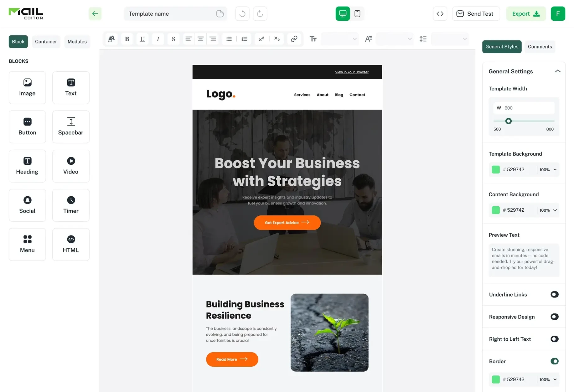
This is where MailEditor truly shines. It is built specifically to solve the responsive design challenge.
Every template in their library is fully responsive right out of the box. You do not need to write a single line of code to ensure your emails look perfect on an iPhone, an Android device, or a desktop computer.
2. Using Too Many Fonts and Colors
Visual chaos is the enemy of clarity. Sometimes marketers think that more is better. They use five different fonts to make things "exciting" and a rainbow of colors to grab attention. The result is usually an email that looks unprofessional and confusing.
Why Simplicity Wins
A clean and consistent design helps readers focus on your content. It directs their eyes to the most important information. According to Campaign Monitor, campaigns using one or two fonts enjoyed a 28% higher click rate compared to those that used more than three fonts.
| Number of Fonts Used | Click-Through Rate |
| 1 to 2 | 4.2% |
| 3 or more | 3.1% |
Overuse of colors is just as damaging. It creates visual noise that distracts from your message. Studies from Adobe highlight that emails maintaining a strict brand palette see up to 32% greater brand recall from recipients.
Common Typography Mistakes
- Font Salad. Mixing serif, sans-serif, and script fonts in one paragraph.
- Rainbow Text. Using a different color for every headline.
- Low Contrast. Using light grey text on a white background makes reading impossible for people with visual impairments.
Best Practices for Fonts and Colors
Stick to a simple and consistent style guide.
- Limit your fonts. Use no more than two different fonts. One for headings and one for the body text is usually perfect.
- Choose your colors wisely. Stick to two or three primary brand colors. Use a neutral color like black or dark grey for your main text.
- Prioritize readability. Ensure there is high contrast between your text and background colors. Dark text on a light background is always the safest bet.
Using a tool like MailEditor helps you stay disciplined. Their editor allows you to set global styles for your email.
This means you can define your brand colors and fonts once, and they will apply automatically to every new section you add. It keeps your design tight and professional without extra effort.
3. Forgetting About White Space
White space is also known as negative space. It is the empty area around the elements in your design. It is one of the most overlooked yet powerful tools in a designer's toolkit.
When an email is crammed with text and images without any breathing room, it becomes an intimidating wall of content.
The Psychology of Space
A lack of white space makes it hard for readers to process information. Our brains need breaks to absorb what we are reading.
When content is crowded, cognitive load increases. Readers might feel overwhelmed and decide the email is not worth their time.
Proper spacing also creates hierarchy. It tells the reader which elements belong together and which ones are separate. It guides the eye down the page in a logical flow.
Benefits of White Space
Improved Comprehension. A study by Wichita State University found that white space improves reading comprehension by nearly 20%.
Enhanced Focus. It draws attention to the elements that matter, like your call to action.
Elegant Aesthetic. Generous spacing makes your design look more premium and sophisticated.
How to Use White Space Effectively
Embrace the empty areas in your design.
- Paragraph Spacing. Add extra padding between paragraphs to break up chunks of text.
- Margin Breathing Room. Ensure there is plenty of space between your content and the edge of the screen.
- Button Isolation. Give your CTA buttons plenty of room so they stand out clearly.
If you struggle with spacing, MailEditor has you covered. Their drag-and-drop blocks come with pre-set padding and margins that follow design best practices. You can easily adjust them with a slider if you need more room, but the defaults ensure your email never looks cluttered.
4. Making Your Call to Action Hard to Find
The call to action (CTA) is arguably the most important part of your email. It is the button or link that tells subscribers what you want them to do next.
Whether it is "Shop Now" or "Read More" or "Sign Up," your CTA should be impossible to miss. Yet many emails bury their CTA or make it blend in with the rest of the content.
The Cost of a Hidden CTA
If subscribers cannot find your CTA, they cannot take the desired action. You could have the most persuasive copy and the most beautiful images, but without a clear CTA, your campaign will fail. A weak or hidden CTA is a missed opportunity for conversions.
Elements of a Strong CTA
- High Contrast Color. Your button color should contrast sharply with the background. If your email is mostly blue, try an orange or yellow button.
- Action-Oriented Text. Use verbs that inspire action. Instead of "Click Here," try "Get Your Free Ebook" or "Start Saving Today."
- Prominent Placement. Place your primary CTA "above the fold" so it is visible without scrolling.
- Size Matters. Make the button large enough to be easily tapped on a mobile screen. Generally, a height of at least 44 pixels is recommended for touch targets.
Repetition is Key
For longer emails, do not be afraid to repeat your CTA. Place one near the top, one in the middle, and one at the end. This gives the reader multiple opportunities to click as they scroll through your content.
MailEditor provides a variety of stylish buttons that you can drop right into your design. You can customize the hover effects, border radius, and shadow to make them pop off the screen.
5. Ignoring Accessibility
Accessibility in email means designing your content so it can be understood by everyone. This includes people with disabilities such as blindness or visual impairments.
Ignoring accessibility shuts out a significant portion of your audience and can even have legal implications in some regions.
Why Accessibility Matters
Approximately 15% of the world's population lives with some form of disability. If your email is not accessible, you are essentially telling those people that their business does not matter to you. Furthermore, accessible design is often just good design. It improves readability and usability for everyone.
Accessibility Checklist
- Alt Text for Images. Always include descriptive alternative text for your images. Screen readers use this to describe the image to visually impaired users. It also displays if the image fails to load.
- Logical Heading Structure. Use H1, H2, and H3 tags in the correct order. Screen readers use headings to navigate through content.
- Color Contrast. Ensure there is sufficient contrast between text and background colors.
- Descriptive Links. Avoid "Click Here." Instead, use descriptive text like "Read our full guide on email design."
MailEditor makes accessibility easy. When you add an image, it prompts you to add alt text. The text editor produces clean HTML that screen readers can parse easily. This helps you stay inclusive without needing to be an accessibility expert.
6. Using Image-Only Emails
It is tempting to design your entire email as one big image in Photoshop. It guarantees that your fonts and layout look exactly the way you want them to. However, this is a major mistake that can destroy your deliverability and engagement.
The Pitfalls of Image-Only Designs
- Image Blocking. Many email clients block images by default. If your email is just one big image, the recipient will see a giant empty box.
- Spam Filters. Spam filters cannot read text inside images. If they cannot read your content, they might assume it is spam and block it.
- Non-Responsive. A single large image will shrink down on a mobile screen, making the text unreadable.
- No Accessibility. Screen readers cannot read the text flattened inside an image.
The Balanced Approach
Use a mix of live text and images. Live text is the text you type directly into the email editor. It renders perfectly on all devices, is readable by spam filters and screen readers, and displays even if images are blocked.
Use images for visuals like product photos or banners, but keep your main message and CTA as live text. This ensures your email is functional and readable under all conditions.
7. Sending Without Testing
We have all been there. You are in a rush to get the campaign out. You finish the design, write the subject line, and hit send immediately.
Five minutes later, you realize you made a typo in the headline or linked to the wrong landing page. It is a sinking feeling that is entirely preventable.
The Importance of a QA Process
Sending an email without testing is like driving a car without checking the brakes. You are hoping for the best but risking a crash. Errors in your email make you look unprofessional and sloppy. They erode trust with your audience.
What to Test Before Sending
- Broken Links. Click every single link in your email to make sure it goes to the right place.
- Rendering Issues. Send a test email to yourself and open it on your phone and desktop. Check how it looks in dark mode as well.
- Proofreading. Read your copy out loud to catch typos and awkward sentences.
- Subject Line. Double-check your subject line and pre-header text for errors.
A Reliable Workflow
Create a pre-send checklist and stick to it every time. If possible, have a colleague review the email as well. A fresh set of eyes often catches mistakes you missed.
With MailEditor, you can easily send test emails to yourself or your team directly from the editor. This makes the review process seamless and encourages you to test thoroughly before the final send.
8. Neglecting the Pre-Header Text
The subject line gets all the glory, but the pre-header text is its trusty sidekick. The pre-header is the short snippet of text that appears next to or below the subject line in the inbox. It gives readers a preview of what is inside.
The Missed Opportunity
Many marketers leave the pre-header blank or let it default to "View in Browser." This is a waste of valuable real estate. The pre-header is your second chance to hook the reader. It can significantly boost your open rates.
Writing Effective Pre-Headers
- Complement the Subject Line. If your subject line asks a question, use the pre-header to hint at the answer.
- Add Urgency. Use phrases like "Ends Tonight" or "Limited Stock."
- Keep it Short. Most mobile devices only show about 35 to 50 characters of pre-header text.
MailEditor includes a dedicated field for pre-header text in its settings. This ensures you never forget to add it and that it is coded correctly into the email.
9. Overloading with Content
We want to share everything with our subscribers. We want them to see our new products, read our latest blog post, follow us on social media, and sign up for our webinar. But putting too much into one email leads to decision paralysis.
The Paradox of Choice
When people are presented with too many options, they often choose none. An email with ten different calls to action is confusing. The reader does not know what is most important, so they simply close the email.
Focus on One Goal
Every email should have one primary goal. Ask yourself what the single most important action is that you want the reader to take. Design the entire email around that one goal.
If you have multiple things to share, consider sending separate emails or creating a digest-style newsletter with clear sections. Keep the layout clean and organized so the reader can scan easily.
10. Ignoring Dark Mode
Dark mode has exploded in popularity. Many users prefer the darker color scheme because it is easier on the eyes and saves battery life. If your email is not optimized for dark mode, it can look terrible or even be unreadable.
Dark Mode Disasters
Invisible Logos. If you use a black logo with a transparent background, it will disappear against the dark background of dark mode.
White Boxes. Images with white backgrounds can look like ugly patches on a dark screen.
Unreadable Text. Sometimes email clients invert colors in strange ways, making dark text on a dark background hard to read.
Designing for the Dark Side
Transparent PNGs. Use transparent backgrounds for your logos and icons. Add a white stroke or glow around dark elements so they stand out in dark mode.
Test It. The only way to be sure is to test your email in dark mode.
MailEditor templates are built with modern standards in mind. They often include optimizations that help your email adapt gracefully to dark mode settings.
The Secret Weapon for Flawless Email Design

Avoiding these ten common mistakes can feel like a lot to manage. You have to think about responsiveness, fonts, colors, spacing, accessibility, and dark mode all at once.
Trying to code an HTML email from scratch that checks all these boxes is a massive undertaking. It requires technical skills that most marketers simply do not have.
This is where having the right tool changes everything. I realized early on that I could not do it alone. I needed a platform that handled the heavy lifting for me. After trying several options, I discovered MailEditor. It has become my absolute favorite solution for creating beautiful and effective emails without the stress.
Why MailEditor Stands Out
MailEditor is an HTML email template builder designed to make your life easier. Its intuitive drag-and-drop interface lets you build professional emails in minutes. You do not need to know any code.
The platform is built with design best practices at its core. It handles the technical details so you can focus on your message.
Here is why it is the best choice for marketers and business owners.
1. Massive Library of Free Templates
One of the best parts is that MailEditor offers a huge selection of free email templates. These are not just basic layouts.
They are professionally designed to be responsive and visually appealing. You can browse by industry or purpose. Whether you need a newsletter, a promotional email, or a transactional notification, they have a template for you.
You can simply pick one, customize it with your brand's colors and content, and you are ready to go.
2. Drag-and-Drop Simplicity
The editor is incredibly user-friendly. You can drag elements like images, buttons, text blocks, and social icons right onto the canvas.
You can rearrange them with ease. It feels like playing with digital building blocks. This flexibility allows you to experiment with layouts without breaking the code.
3. Mobile Responsiveness Built-In
As we discussed, mobile design is non-negotiable. With MailEditor, you never have to worry about it.
All their templates and elements are fully responsive. You can switch between desktop and mobile views in the editor to see exactly how your email will look on different devices.
This gives you total confidence before you hit send.
4. Export Anywhere
MailEditor plays well with others. Once you finish your design, you can export the HTML code and use it with any email service provider.
Whether you use Brevo, HubSpot, Klaviyo, or any other platform, you can easily import your MailEditor templates. This gives you the freedom to design in a superior tool while keeping your existing sending infrastructure.
5. Collaboration Features
If you work in a team, MailEditor makes collaboration simple. You can save your designs and share them with colleagues for review.
This streamlines the approval process and ensures everyone is on the same page.
Conclusion
Great email design is within your reach. It does not require a degree in graphic design or years of coding experience. It simply requires an awareness of the common pitfalls and a commitment to clarity and usability.
By being mindful of these ten mistakes, you can create emails that not only look good but also perform exceptionally well.
Remember to prioritize a responsive layout. Maintain a clean and consistent visual style. Use white space effectively to let your content breathe.
Make your call to action pop so readers know exactly what to do. And never underestimate the power of testing.
These principles will help you build stronger connections with your subscribers. They will appreciate the clean, professional, and easy-to-read emails you send them.
This respect for their inbox builds trust and loyalty over time.
If you want to streamline the process and guarantee flawless design every time, I highly recommend giving MailEditor a try.
It is a powerful tool that simplifies email creation. It allows you to build stunning campaigns without any design or coding experience.
Stop letting small mistakes hold your emails back. Start creating designs that truly shine and watch your engagement soar. Your audience is waiting for better emails. Now you have the tools to deliver them.
Written by
A full-stack digital marketer and passionate blogger with more than seven years of hands-on experience helping brands grow, rank, and thrive online.
All postsPopular Blogs
Email Design2 mins to read
Top Email Template Builders & HTML Email Editors for 2026
Compare the best email template builders and HTML editors to design professional, responsive campaigns without coding.

Email Tips7 mins to read
Best Drag and Drop Email Editors in 2026
Discover the best drag and drop email editors in 2026. Compare top tools, features, templates, pricing, and automation to build stunning emails fast.

Marketing7 mins to read
4 Best Unlayer Alternatives to Design Emails
Looking for Unlayer alternatives? Explore the 4 best email design tools to create beautiful, responsive emails faster and easier.
Email Design1 min to read
How to Create an HTML Email Template in Mailtrap
Follow this step‑by‑step guide to creating a responsive HTML email template in Mailtrap. Design, code, and customize your template with confidence.

Marketing6 mins to read
5 Beefree Alternatives to Upgrade Email Design Workflows
Looking for a better email design tool? Explore 5 Beefree alternatives that streamline workflows, improve collaboration, and elevate email campaigns.