Email Footer Examples: 10 Designs and Copy-Ready HTML
Explore 10 email footer examples with visual designs, copy-ready HTML, unsubscribe and contact details, plus practical tips for newsletters and marketing emails.

Md. Yaikub Hossain Razon
The best email footer examples make it easy to recognize the sender, find essential links, and control future emails. A strong footer does not need a complex layout. It needs the right information, a readable design, and links that work when the email reaches a real inbox.
Below are 10 practical footer designs for newsletters, ecommerce promotions, SaaS updates, events, and other common campaigns. Each includes an illustrative preview, a specific use case, and ideas you can adapt. You will also find copy-ready, table-based HTML for building a footer that suits your brand.
What Is an Email Footer?
An email footer is the section at the bottom of an email. In a marketing campaign, it typically identifies the sender, gives recipients useful contact or navigation links, and provides a way to manage subscriptions or opt out. Depending on the message and applicable rules, the footer may also include a postal address, privacy information, and required disclosures.
The content depends on the type of email. A weekly newsletter may need clear subscription preferences and a reason the reader receives it. An online store can add support and returns links. A purely transactional receipt may prioritize order assistance instead of promotional navigation.
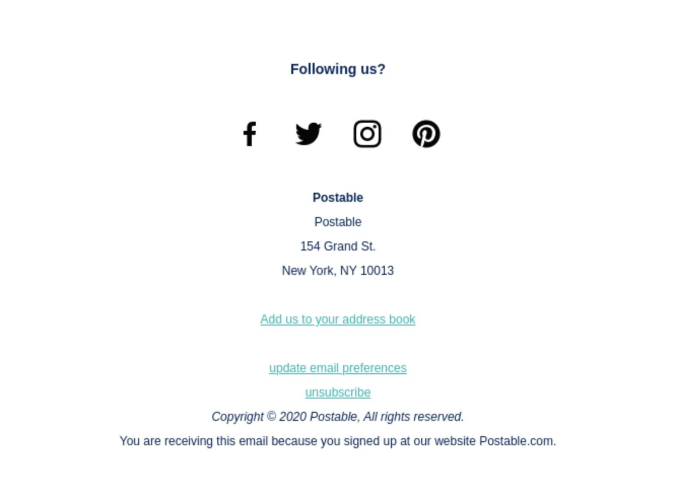
Email Footer Anatomy: Five Useful Layers
Example marketing footer layout
Optional additions: social channels, a help link, privacy policy, or a relevant secondary action.
The order can change, but the practical priority should stay the same: put essential recipient controls and sender information ahead of decorative elements.
10 Email Footer Examples You Can Customize
These are original illustrative examples, not screenshots of real campaigns. The preview text is intentionally simple so you can see the information hierarchy, then replace it with your own business details and working links.
1. Minimal Branded Footer
The simplest design is often the right choice for a short, focused marketing email. Keep the brand identity visible, follow it with the subscription information, and avoid adding several competing calls to action.
[Business postal address]
Unsubscribe · Privacy policy
Best for: Simple announcements, local businesses, and short campaigns.
Why it works: It creates a recognizable closing without making the footer more visually important than the message.
Customize it: Add your legal business name and valid mailing address. Connect the unsubscribe text to your sending platform.
2. Newsletter Footer
A newsletter footer should make an ongoing subscription easy to understand. It can remind readers where they signed up and help them choose a more useful reading frequency.
Monthly digest · Manage preferences · Unsubscribe
[Publisher name] · [Postal address]
Best for: Weekly industry newsletters, editorial updates, and content subscriptions.
Why it works: It reduces guesswork about why the reader receives the newsletter and gives choices beyond a single unsubscribe option.
Customize it: Use a real preference center if your email platform supports one; do not display a link that leads nowhere.
3. Ecommerce Promotional Footer
A retail promotion footer works best when it connects the campaign to practical shopping support. Returns, shipping, customer service, and preferences can sit together without competing with the main sale CTA above.
You received this promotion because you subscribed to offers.
Preferences | Unsubscribe
[Store legal name] · [Postal address]
Best for: Product launches, seasonal sales, ecommerce newsletters.
Why it works: Shoppers can find reassurance and help at the end of an offer without searching the entire website.
Customize it: Keep navigation short. Link only to real shipping, returns, and support destinations.
4. SaaS Product Update Footer
Software companies often send different kinds of messages: account notices, product news, and marketing campaigns. A useful footer makes it clear which stream the subscriber is receiving.
Product settings · Help center · Unsubscribe
[Company postal address]
Best for: SaaS product newsletters, release announcements, and feature campaigns.
Why it works: It provides a clear route to notification settings and support while distinguishing product news from essential account communication.
Customize it: Make opt-out options match the real message category. A feature-promotion newsletter should not pretend to be a required account notification.
5. B2B Company Footer
A B2B newsletter can use a slightly more formal footer with company identity, a contact route, and relevant business information. Keep the layout easy to scan instead of adding a long company description.
[Contact email]
Unsubscribe from marketing
Best for: Professional services, agencies, consulting businesses, and enterprise newsletters.
Why it works: It supports sender credibility and gives potential clients a direct contact path.
Customize it: Add registration details only where applicable; use correct legal entity information.
6. Event and Webinar Footer
Event promotion footers can point recipients to the organizer and help information while keeping the registration CTA in the main email. Once someone registers, the footer can also carry a support link for event-related questions.
Event information · Email preferences · Unsubscribe
[Organizer legal name] · [Postal address]
Best for: Webinar invitations, conference promotions, workshops, and event newsletters.
Why it works: It gives attendees one place to find event support and distinguish promotional messages from event logistics.
Customize it: For post-registration scheduling messages, use the separate event reminder email examples guide instead of expanding this footer into another event-reminder tutorial.
7. Nonprofit and Community Campaign Footer
A nonprofit campaign footer can identify the organization and provide practical ways to stay involved. Registration or charity numbers, where applicable, belong in a legible supporting line instead of replacing the standard sender and opt-out information.
Our mission · Volunteer · Manage updates
Unsubscribe
[Legal entity / address] [Registration details, if relevant]
Best for: Nonprofit newsletters, community campaigns, and fundraising email updates.
Why it works: It reinforces recognition and gives readers context for the organization behind the message.
Customize it: Use a verified registration or charity number if you display one. Avoid claiming any status that cannot be substantiated.
8. Preference-Center-First Footer
When subscribers receive several kinds of content, a preference-focused footer helps them choose what they want. The prominent option should be to manage topics or frequency, while the unsubscribe path remains easy to see.
Best for: Multi-topic newsletters, online education, membership brands, and frequent campaigns.
Why it works: It gives recipients control without making the opt-out process difficult.
Customize it: Use actual preference-center functionality. Avoid hiding or replacing the unsubscribe link with a preference-only flow.
9. Community and Social Footer
A brand community newsletter can use the footer to invite readers to other useful channels. Social links should be secondary to sender identity and recipient controls, not a wall of icons.
You joined our email list at [website].
Manage preferences · Unsubscribe
[Brand postal address]
Best for: Creator communities, lifestyle newsletters, membership programs, and brand communities.
Why it works: It extends the relationship beyond the inbox without adding a competing sales pitch.
Customize it: Link only to social accounts the organization actually maintains and keep the text labels accessible.
10. Transactional Notification Footer
A receipt, shipping confirmation, or account-security message needs a practical closing. Support and account-related links are often more useful here than promotional navigation.
Get support · View your account
[Company contact / postal information]
Best for: Receipts, shipping notices, account alerts, and essential service messages.
Why it works: It keeps administrative information easy to find while letting the message stay focused on its transaction.
Customize it: Requirements depend on the primary purpose of the message. A purely transactional email may be treated differently from an email that primarily promotes products. Check the applicable rules and your sending platform.
What Should an Email Footer Include?
A good email footer includes the information readers need for that specific message. Use this short reference when choosing between a compact layout and a richer branded design.
| Element | Marketing email | Transactional email |
|---|---|---|
| Sender identity | Clearly identify the business | Clearly identify the service/business |
| Postal address | Include where required, such as U.S. commercial email | Depends on message and applicable rules |
| Unsubscribe | Clear, functioning opt-out for commercial promotions | Different treatment may apply if purely transactional |
| Preferences | Useful for multi-topic campaigns | Useful for optional product notifications |
| Support / contact | Good addition where relevant | Often a primary footer link |
| Privacy / social links | Optional based on use case | Usually secondary to service links |
For U.S. commercial email, the FTC CAN-SPAM guidance calls for a valid physical postal address and a way to opt out. The FTC also explains that purely transactional or relationship messages are assessed differently, based on their primary purpose. Other jurisdictions and email providers may impose additional requirements. Mailchimp’s footer documentation is a useful example of how a sending platform handles required merge tags and subscription controls.
Copy-Ready HTML Email Footer Code
Visual examples are useful for planning, but email clients interpret HTML differently from normal webpages. For the actual email, a table-based layout with inline styles is a dependable starting point. The snippets below use placeholders instead of real personal information or fabricated unsubscribe destinations.
%%UNSUBSCRIBE_URL%%, %%BUSINESS_ADDRESS%%, and %%BRAND_NAME%% with real values or the correct merge tags for your ESP. Never send a campaign with placeholder links.HTML Example 1: Minimal Marketing Footer
Use this when one compact footer is enough. The full table is self-contained, centered within a 600px email container, and uses editable text instead of image-only details.
HTML Example 2: Ecommerce Promotion Footer
A promotional store footer can include helpful shopping links while keeping subscription information visible. Keep the navigational row short, and confirm every destination before sending.
HTML Example 3: SaaS Product Newsletter Footer
This version separates account-related support links from an opt-out for optional product news. It is intended for a promotional or editorial product newsletter, not as a replacement for mandatory account-notice logic.
When you adapt any snippet, make sure the entire message, not just the footer, displays correctly in Gmail, Outlook, and mobile inboxes. You can use the email pre-send checklist to verify URLs, readability, images, and footer details.
Email Footer Design Best Practices
- Keep essential information readable. Avoid ultra-light gray or extremely small type for the address and unsubscribe link.
- Use the sender’s real identity. Readers should recognize who is contacting them.
- Make opt-out controls easy to find. Do not hide them behind unrelated navigation.
- Choose a compact hierarchy. Usually one brand line, one supporting line, and a short row of links are enough.
- Make mobile wrapping natural. Let links wrap or stack instead of squeezing them into fixed-width columns.
- Use genuine destinations. A visually attractive footer is not ready until preferences, privacy, support, and unsubscribe links work.
- Keep live text wherever possible. Avoid relying on one large footer image for important content.
- Test real inboxes. Verify spacing, colors, click targets, and accessibility after sending test messages.
For responsive layouts, see MailEditor’s mobile-responsive email design guide. If the campaign collects or uses personal data, the separate GDPR and email design guide covers additional design considerations; local requirements may vary.
Email Footer vs. Email Signature: What Is the Difference?
An email footer usually describes the closing section of a designed newsletter, promotion, or automated message. It often contains organization information, subscription controls, and links. An email signature usually identifies an individual sender, with a name, role, phone number, and possibly a logo.
A person’s business signature can appear above a company footer, and some articles use the terms loosely. For this guide, the examples focus on marketing email footers. Readers looking for dimensions and images in personal signatures should use the separate email signature size and image guide.
How to Create and Reuse an Email Footer in MailEditor
MailEditor supports visual email building and reusable sections. Its Module Builder includes footer blocks, making it easier to start from an existing layout than to recreate the same information for every campaign.
- Open the MailEditor email editor or select an existing design from the email template library.
- Choose or create a footer section with the brand name, contact information, and links your campaign needs.
- Replace placeholder company details and connect the correct unsubscribe and preference controls through your sending setup.
- Match the footer’s spacing and brand appearance to the rest of the email.
- Preview the full email on desktop and mobile, then send test messages and verify every link.
- If you will reuse the design, save the section as a reusable block where your workflow supports it.
For a broader reusable-section workflow, read What Is Modular Email Design?
Choose a footer module, customize the content, then review the completed email before export.
Final Answer
The best email footer examples are the ones readers can actually use. Start with a clear brand identity, add the sender and subscriber information your message requires, and keep the footer easy to scan on mobile. Choose a design that fits the type of email, then replace every placeholder with real business details and working links.
For most campaigns, a minimal footer is enough. If your audience needs product support, event details, or content preferences, add those elements deliberately rather than turning the last section of the email into another full navigation menu.
Frequently Asked Questions
Popular Blogs
Email Design2 mins to read
Top Email Template Builders & HTML Email Editors for 2026
Compare the best email template builders and HTML editors to design professional, responsive campaigns without coding.
Email Design9 mins to read
Email Signature Size and Image Best Practices
The ideal email signature is 320–600px wide and 90–200px high. Learn the best image sizes, formats, file limits, and mobile-friendly design tips.

Email Tips7 mins to read
Best Drag and Drop Email Editors in 2026
Discover the best drag and drop email editors in 2026. Compare top tools, features, templates, pricing, and automation to build stunning emails fast.
Marketing7 mins to read
4 Best Unlayer Alternatives to Design Emails
Looking for Unlayer alternatives? Explore the 4 best email design tools to create beautiful, responsive emails faster and easier.
Marketing6 mins to read
5 Beefree Alternatives to Upgrade Email Design Workflows
Looking for a better email design tool? Explore 5 Beefree alternatives that streamline workflows, improve collaboration, and elevate email campaigns.