GDPR and Email Design: What You Need to Know
Learn how GDPR impacts email design, from consent and accessibility to data protection, and ensure your campaigns stay compliant and effective.

Shahin Alam
A truth about email design decisions is that most of them happen fast. You can adjust spacing, change a button’s color, edit the footer line, and move on. In many cases, this is understandable. After all, deadlines approach, and your campaigns need to go live. This makes design feel like a visual problem only; it just needs to look right and work everywhere.
Over time, though, I started to notice something else. Namely GDPR and email design. These two things are more connected than many teams realize, even when no one is actively thinking about compliance (and let’s be honest, many don’t). Small layout choices affect things like how consent is understood, how transparent a message feels, and whether or not a reader actually trusts what they are seeing in the email.
When you design an email, the privacy rules never really announce themselves. They show up indirectly, in how readable a signup section is, or how obvious the unsubscribe link feels. These things are visual before they are legal.
In my time working on emails, I’ve seen teams lose sleep over wording while barely paying attention to the structure. Many also rely on templates built years ago, assuming compliance lives somewhere else. It rarely does. The design of your email carries more responsibility than you might give it credit for.
This blog is not a legal breakdown. Nor is it a warning piece. It is a guide that will help you understand how everyday email design decisions and privacy expectations are linked, even if designers don’t realize it. Once you see that connection, though, it becomes hard to ignore.
Key Takeaways
- Most compliance problems start with designs that make important information easy to overlook or feel secondary.
- Visual balance matters, and more than many teams expect. Rushed or buried consent language is easily noticed by readers.
- Old templates may seem safe but can often be risky. Privacy policies and expectations change over time, meaning old layouts can age badly.
GDPR and Email Design Are Closely Connected in Real Campaigns

Many teams don’t realize that GDPR and email design are connected to each other. And that’s fine when starting out. It usually takes working on a number of campaigns to be wary of this connection.
At first, GDPR feels like something handled elsewhere, outside the email design. Legal writes the policy, and marketing adds a checkbox. Design just has to make things look decent. It sounds like a neat categorization of tasks on paper , but it never holds up in practice.
I first started noticing the overlap when reviewing older templates. Nothing was technically missing, per se. The required links were there, and the wording existed as it should have. Yet, something felt off. Important information was pushed down, making it somewhat lost within the rest of the message. It meant that the design was telling a different story than the content.
That is where GDPR and email design begin to overlap in a very real way. You see, privacy expectations rely on clarity, and it is important for this clarity to be visual before it is verbal. An email’s hierarchy decides what gets attention first. Its contrast decides what feels optional, and spacing decides what looks intentional versus added as an afterthought.
Once you see it, the connection becomes obvious. If, for instance, an unsubscribe link is hidden away in a dense footer, it feels noticeably different from one given room to breathe. Readers pick up on these cues quickly. They might not always speak up about it, but they sure react to it.
In real campaigns, this shows up in a few predictable places.
- Signup sections where consent language and text are hidden away under heavy promotional materials
- Footers that technically include required links, but discourage interaction with them through complex layouts
- Preference options that do exist but are get pushed into the background
Of course, it is safe to say that none of this usually comes from bad intent. If anything, it comes from habit. Designers feel comfortable with reusing what worked visually before, without stopping to question or consider how privacy expectations may have have shifted since the last time a template was used. Marketers focus on performance metrics, not visual signals of trust.
This is where the aforementioned connection becomes obvious. A good email design supports compliance when it considers clarity as a key design goal, not a restriction. When the email hierarchy feels honest and important information is given room to be seen, the rest tends to fall into place.
Layouts Affect Consent Before Checkboxes Do

In my early days, I used to think if the wording mentioned consent, it would be good enough. That if the text was clear enough, the job was done. Over time, I realized I was wrong. As it turned out, the layout had the bigger say here, more than the wording.
What you need to understand is that the layout sets the mood before anything is even read. The spacing alone can change how serious something feels. When the consent language is cramped and squeezed between louder and flashier elements, it feels like an interruption. But if you give it space, it feels intentional. See what happens here? The words don’t change, but the message does. The clarity does.
The font size in an email also plays a similar role. Smaller text signals lower importance, while larger text grabs attention. Most of the time, the decision to go with a smaller font size happens out of habit, not intention. I have watched many teams shrink the consent copy just to keep a design clean, without realizing the impact of that choice. Readers notice, even if they skim and scroll past.
Another layout factor that you should know about is contrast. High contrast pulls the eye. Low contrast lets information go. When the consent details sit in muted colors while calls to action are bold and bright, the hierarchy is clear. It sends the reader a clear message. One that says that one thing matters more than the other. This visual order influences how informed the choice actually feels.
Placement matters, too. When a reader opens an email, information placed towards the top feels essential, and content pushed towards the bottom feels less important. When consent information gets buried at the wrong end, it stops feeling like an important point.
These patterns become easier to spot once you start paying attention. The same layout decisions show up again and again, copied and forwarded without a second thought. And that is usually how issues arise.
General Data Protection Regulation (GDPR) and Email Design Can Help Create Effective Templates

Once you understand privacy expectations, they start helping you develop a template structure that works. Headers get simplified, footers grow taller there, and other similar changes take place.
GDPR and email design meet most clearly inside the template structure. When this happens, the headers begin to carry less noise and provide more context. They respect clarity instead of leading with promotional intent.
The footers change even more. What once felt like dead space turns into a working area, where unsubscribe buttons, links, and preferences are easier to spot and use.
The unsubscribe button or link visibility is a good example to use here. When it is buried, trust erodes. But if teams make that option visible, it does not hurt performance the way many fear. In fact, in many cases, it does the opposite.
Preference links follow a similar path. Earlier templates often treated them as optional extras, while later versions give them structure and spacing. As a result, your email gains the reader’s trust.
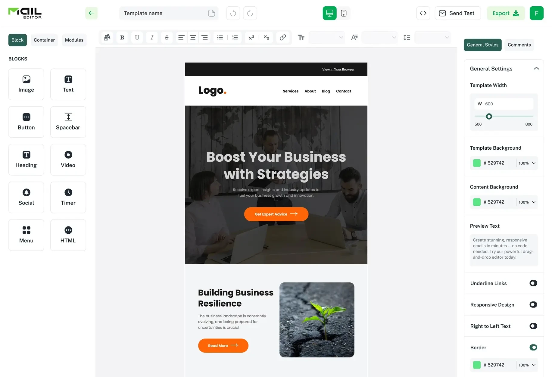
This is where reusable systems help. Tools like MailEditor make it easier to adjust modules once and use them across campaigns. When templates live as editable building blocks instead of static files, even small improvements towards GDPR compliance stop feeling like a problem and become part of the workflow.
This simple comparison table helps to make this difference clearer.
| Design area | More compliant approach | Riskier approach |
| Header | Clear context with less focus on visuals | Heavy promotion that pushes down clarity |
| Footer | Visible unsubscribe and preference links | Dense text block with less visible links |
| Modules | Reusable blocks updated over time | Older designs copied without review |
| Link placement | Easy to find and read | Technically present but visually hidden |
Over time, these structural choices add up. Templates start carrying privacy awareness quietly, without slowing teams down or changing how work gets done.
Common Email Design Decisions That Risk GDPR Non-Compliance

Most issues I see with email designs are not the result of bad decisions. No, in fact, they come from repetition. When the same templates get reused, small changes here and there pile up, and no one pauses to look at the whole thing and reassess how the design now reads. Over time, that is where risk tends to form.
The following are some common practices and design decisions that risk non-compliance with GDPR.
1. Shrinking important text to protect the layout
This usually starts with good intentions, but has negative results. Of course teams want emails to feel clean and balanced, and reducing consent details or preference links just a little bit seems like a quick, harmless fix. However, it never stays “just a little bit.” The shrinking increases a bit more when the next campaign rolls around, and then a little more in the one after that. Eventually, the text is still there, but it no longer feels meant to be read. As you know by now, this is not how things work.
2. Treating the footer as a dumping ground
Another common practice for many teams is filling footers with information they don’t want to design the email around. The links stack up, spacing disappears, and contrast drops. Technically, the information exists in the email. But visually, it becomes a huge challenge to even find it.
3. Reusing old templates blindly
Sure, a template may have worked nicely a few years ago, but that doesn’t guarantee that it will work just as well now. As I mentioned before, privacy expectations change. If the structure stays frozen and doesn’t adapt to this change, results won’t come. Teams trust what is familiar, even when the surrounding standards have shifted.
4. Hiding choice behind noise
When something is crowded in amongst many other options, it loses weight. This is exactly what happens when unsubscribe or preference links are bundled towards the end of an email. The choice is still offered, of course, but it feels buried, and becomes less effective. It is usually the result of adding just one more link each time.
5. Relying on wording to fix visual problems
I have watched teams rewrite consent text again and again and again, hoping clarity will solve everything. But what they fail to realize is that the sentences are not the issue. The placement is. If an email design does not give the words a fair chance, it is unjust to expect them to work.
None of these mistakes happen overnight. They build slowly, one design decision at a time. That is why they are easy to miss until someone steps back and looks at the whole picture.
Designing GDPR Safe Emails Without Slowing Down Daily Work.

One of the first concerns I hear is speed. Teams worry that paying attention to privacy will slow everything down. More checks. More reviews. More back and forth. In practice, the opposite usually happens once systems are in place.
Problems arise when every campaign is treated as a fresh start. Designers adjust things manually. Marketers double check details at the last minute. Small changes slip through because everyone is rushing. That is not a GDPR problem. That is a workflow problem.
What tends to work better is consistency. When templates already account for visibility, spacing, and structure, there is less to think about later. You are not redesigning consent areas every time. You are working within a system that already reflects how privacy expectations should look.
This is where reusable layouts matter. When headers, footers, and preference areas live as modular pieces, improvements stick. You fix something once and it carries forward. Over time, those small decisions add up and remove friction instead of adding it.
I have seen teams move faster after tightening their template structure. Not because they cut corners, but because fewer questions come up mid process. The design already answers them.
Tools like MailEditor fit naturally into this kind of workflow. Being able to adjust a shared template and reuse it across campaigns keeps things steady. It reduces the temptation to make quick visual compromises just to ship on time. You can get a sense of how that works by looking at how email templates are built and reused with MailEditor.
GDPR safe design does not need to feel heavy. When it is built into the system, daily work actually becomes simpler. Fewer surprises. Fewer fixes. Just cleaner execution.
Why Involving Designers Early Makes GDPR Feel Less Restrictive

I have noticed that GDPR feels most frustrating when it enters the process too late. When a design is already locked in and someone points out an issue, it feels like a setback. Things have to be reworked. Timelines stretch. Tension creeps in. That frustration often gets blamed on the rules themselves, even though the real issue is timing.
When designers are involved early, the dynamic changes. Conversations start differently. Instead of asking how to fix something, teams ask how to shape it from the beginning. Legal brings context. Marketing brings intent. Design translates both into something visible. None of it feels dramatic. It just feels planned.
I have seen this approach prevent more problems than any checklist ever could. Headers get structured with clarity in mind. Footers are designed to function, not just exist. Preference links are given space before anyone needs to argue for it. These choices happen quietly, almost casually, when design is part of the early discussion.
This is not about designers becoming legal experts. It is about awareness. When designers understand the purpose behind certain requirements, they make better visual decisions without being told. The same goes for legal teams who see how design constraints actually work in practice.
What stands out to me is how much calmer the process becomes. Fewer revisions. Fewer last minute questions. Fewer compromises that feel rushed. The work moves forward with less friction because prevention replaces correction.
GDPR stops feeling like a barrier when it is treated as a shared responsibility. Not owned by one team. Not enforced at the end. Just considered along the way, in small, practical ways that add up over time.
Conclusion
To summarize, I no longer see GDPR as something that sits outside the design process. If anything, it lives inside it. Things like spacing choice, footer adjustments, and every decision about what gets seen first carries weight, because readers respond positively to what feels clear and fair.
Email design has always shaped trust. GDPR simply makes that relationship stronger. When teams treat privacy as a responsibility towards their readers, the email and connection feel more honest. Emails that stop trying to hide important information and start presenting it with intention give readers a completely different message and experience, even if they never think about compliance directly.
What gives me optimism is how manageable this becomes once you understand and acknowledge it. Small design habits add up, templates improve, and workflows become smoother. The pressure also fades, because fewer corrections are needed later on.
Tools that support consistent template design, like MailEditor, fit naturally into that kind of thinking. Not as a solution to a legal problem, but as a way to keep design decisions steady over time.
Looking ahead, the teams that treat GDPR as an important part of their design and include it early on will do best, even more so as expectations continue to evolve.
Written by
A full-stack digital marketer and passionate blogger with more than seven years of hands-on experience helping brands grow, rank, and thrive online.
All postsPopular Blogs
Email Design2 mins to read
Top Email Template Builders & HTML Email Editors for 2026
Compare the best email template builders and HTML editors to design professional, responsive campaigns without coding.
Email Tips7 mins to read
Best Drag and Drop Email Editors in 2026
Discover the best drag and drop email editors in 2026. Compare top tools, features, templates, pricing, and automation to build stunning emails fast.

Marketing7 mins to read
4 Best Unlayer Alternatives to Design Emails
Looking for Unlayer alternatives? Explore the 4 best email design tools to create beautiful, responsive emails faster and easier.
Email Design1 min to read
How to Create an HTML Email Template in Mailtrap
Follow this step‑by‑step guide to creating a responsive HTML email template in Mailtrap. Design, code, and customize your template with confidence.

Marketing6 mins to read
5 Beefree Alternatives to Upgrade Email Design Workflows
Looking for a better email design tool? Explore 5 Beefree alternatives that streamline workflows, improve collaboration, and elevate email campaigns.