Ecommerce Email Design: Practical Layouts & Examples
Explore ecommerce email design best practices with 5 real layout examples. Learn product grids, CTAs, mobile design tips, and customize MailEditor templates.

Md. Yaikub Hossain Razon
Ecommerce email design is the way you organize your message, product images, offers, and calls to action so shoppers can understand an email quickly and know what to do next. A strong design is not necessarily the longest or most colorful. It matches one customer moment, whether that is a first welcome, a new product launch, a promotional newsletter, or an order confirmation.
This guide explains practical layouts, mobile-friendly design principles, and five real MailEditor email examples. You can compare the approaches, see which design fits your goal, and open the corresponding editable template rather than starting from a blank canvas.
Need an ecommerce email layout?
Browse ready-made designs for product promotions, newsletters, customer updates, and more.
What Makes a Good Ecommerce Email Design?
A good ecommerce email design connects the customer’s reason for receiving the message to one useful next step. For a promotional email, that may be browsing a sale or viewing a featured item. For an order confirmation, the next step may simply be checking an order or contacting support.
Most layouts work better when these elements appear in a clear sequence:
- Recognizable header: a clear logo and minimal navigation.
- Headline with a purpose: state the benefit, promotion, or update immediately.
- One primary action: make the most important CTA easy to identify.
- Relevant product or detail blocks: show only what supports the goal.
- Trust and next-step information: shipping, returns, support, or order details where relevant.
- Useful footer: brand and contact information, plus required email preferences or unsubscribe details where applicable.
If you are choosing between formats, start with the goal rather than the colors. The guide to choosing a template for your campaign goal explains how to match the structure to the message.
5 Ecommerce Email Design Examples Using MailEditor Templates
These five designs illustrate different layout decisions across the customer journey. They are editable MailEditor templates, not screenshots of real customer campaigns. The images shown below are template previews, and the example descriptions focus on design choices rather than repeating each product page.
Jump to a design:
1. Welcome Email Template for Ecommerce
Design focus: Welcome & first-purchase design

Best for: Online stores introducing new subscribers to their products and brand.
Why the design works: The layout opens with a welcoming headline and an obvious route to browse. Category cards then give shoppers several useful ways into the catalog, followed by reassurance about shipping, returns, and support. That order matters: introduce the brand, help customers find something relevant, then reduce hesitation.
Customize it: Swap the category labels and images for your real collections. Link each category card to its matching landing page, and keep the first CTA consistent with the main browsing goal.
2. Skincare Product Promotional Email Template
Design focus: Product-grid & merchandising design

Best for: Beauty, skincare, and other product-rich ecommerce promotions.
Why the design works: This promotional layout brings a clear first-order offer near the top, then uses a featured product and several curated product cards to help customers explore. The visual rhythm switches between a hero, smaller product blocks, and short benefit-led descriptions, so the email does not feel like a single oversized catalog.
Customize it: Lead with one genuine offer. Keep product images consistent in size, use short descriptions, and direct each product button to its own product page rather than using a generic collection URL.
3. Product Launch Email Template for Wellness Brand
Design focus: Hero-led product storytelling

Best for: Brands introducing a new item, featured collection, or flagship product.
Why the design works: A prominent hero establishes the featured product before the reader reaches supporting information. This gives the launch one central story and avoids making several products compete for attention. Secondary content can explain benefits, usage, or why the product is new.
Customize it: Use a high-quality image of the actual product and a specific launch headline. Place the primary product or collection CTA where the offer is explained; remove unrelated service or editorial blocks.
Want more layout options? Compare additional ecommerce retail email templates for campaigns beyond these five examples.
4. Product Newsletter Email Template
Design focus: Editorial ecommerce newsletter

Best for: Premium brands, specialty retailers, and stores sharing product ideas alongside stories.
Why the design works: This newsletter-oriented design is useful when shoppers need context rather than just a price. A lead story creates interest, while supporting product or category blocks provide clear routes to browse. Short text sections and consistent heading styles make the longer layout feel organized.
Customize it: Keep one editorial theme per email: a collection story, seasonal guide, or product use case. Use short paragraphs, then connect every recommended item to a relevant destination.
5. Order Confirmed Email Template
Design focus: Transactional & post-purchase clarity
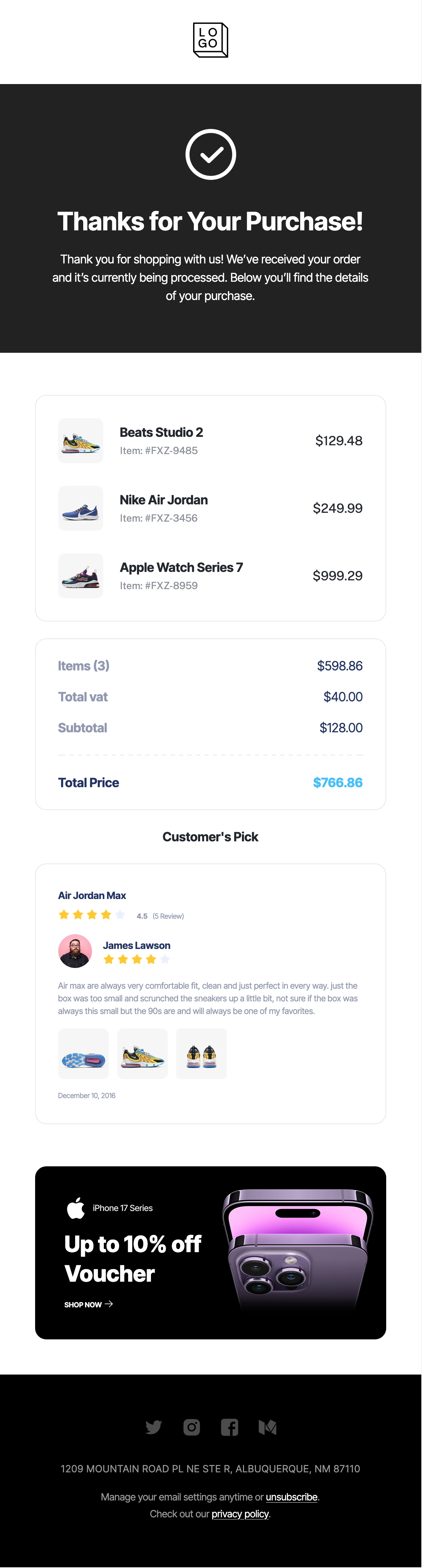
Best for: Ecommerce order confirmations and post-checkout customer communications.
Why the design works: Instead of leading with a discount, this layout leads with certainty: the customer can see that the order was recorded, what was purchased, and what to expect next. Product names, quantities, and totals should be easy to scan without making customers search through decorative content.
Customize it: Connect the order details to your store’s actual transactional data. Use accurate order status language, real totals, support information, and a useful order-management link; do not imply shipping has started until it has.
Which Ecommerce Email Layout Should You Choose?
The ideal layout changes with the customer’s task. Use this short comparison as a starting point; it is a design-choice guide, not a claim that one template will outperform every other.
| Customer moment | Layout to prioritize | Primary action |
|---|---|---|
| New subscriber | Welcome hero + category paths | Browse a category |
| Product promotion | Offer + curated product cards | Shop a featured item |
| New product launch | Hero product + benefits | Explore the launch |
| Editorial newsletter | Story + product sections | Read or shop the collection |
| After purchase | Order summary + next steps | View order details |
Ecommerce Email Design Best Practices for Mobile
Design the mobile reading path first. A grid that looks clean on a wide desktop may become crowded on a phone, and a decorative hero can push the important action too far down. The goal is fast scanning, not fitting the entire desktop version onto a small screen.
- Keep the content column controlled: a main email area around 600–640px is a common desktop starting point, but it should adapt to narrower viewports.
- Prioritize legible copy: begin with approximately 16px body text, comfortable line height, and short paragraphs. Test the final font rendering in actual email clients.
- Use touch-friendly CTAs: make buttons visually distinct, with enough padding and an easy-to-tap target (around 44px tall is a useful minimum).
- Stack product cards: two-column desktop grids should collapse or remain readable on narrow devices; do not force tiny product names and prices.
- Protect essential information: use live text for headlines, prices, and the key CTA instead of placing everything inside a single image.
- Check image behavior: choose consistent crops, use meaningful alt text, and ensure product photographs remain clear at mobile widths.
For deeper guidance, read Best Practices for Mobile Responsive Email Design. The Omnisend email design guide also covers mobile hierarchy, readable product sections, and CTA decisions.
Common Ecommerce Email Design Mistakes
- Too many equal-priority CTAs: shoppers cannot tell whether the main goal is to buy a product, read a story, or explore a category.
- Overloaded product grids: six or eight products can crowd the email if each needs a full description and price.
- Unclear offer terms: a discount headline without the actual conditions, dates, or valid landing page creates friction.
- Image-only messages: important information disappears when images are blocked or load slowly.
- Decorative transactional emails: order details should be easier to find than optional recommendations or promotions.
- Unverified mobile rendering: line breaks, narrow CTAs, and misplaced columns can change after replacing sample content.
A useful editing rule is to remove one section before adding another. If a block does not explain the offer, build trust, help a reader choose, or support the next action, it may not belong in that send.
How to Create an Ecommerce Email Design With MailEditor
You can start with an editable design and adapt it to your products and sending platform. The template supplies the layout; your campaign content and final QA determine the finished email.
- Pick the customer moment. Decide whether you are welcoming, promoting, announcing, or confirming an order.
- Choose the closest layout. Select a relevant MailEditor template instead of starting from an unrelated design.
- Replace every placeholder. Update branding, product photos, descriptions, prices, order data, and offer terms.
- Set one main action. Connect the primary CTA and any product-specific buttons to correct landing pages.
- Adjust for mobile. Review image crops, font sizes, product cards, and button spacing after inserting real content.
- Test the finished email. Send test messages, check supported inboxes, review links, and confirm the export fits your email service workflow.
The guide to editing HTML email templates without coding walks through visual customization. Before launch, follow the Email Pre-Send Checklist to catch missing links, layout problems, and incorrect content.
How to Measure Whether the Layout Is Working
Do not judge the design only by appearance or opens. For a product promotion, check which CTA and product blocks earn clicks and whether visitors complete the next step. For an order email, focus on whether customers can find accurate details and use the relevant support or order link.
- Click-through rate: whether recipients click from the email into the store.
- Landing-page engagement: whether the clicked page matches the email’s promise.
- Conversions or revenue: where your analytics and attribution setup reliably support those measurements.
- Customer-support friction: repeated questions about order totals, status, or delivery details may suggest a transactional layout problem.
Test one meaningful variable at a time, such as hero placement, product-card count, or CTA wording, so you can interpret the result. For additional CTA ideas, see How to Improve Email Click-Through Rates.
Final Answer
The strongest ecommerce email design makes a specific customer task feel easy. A welcome email needs a clear first impression and helpful category paths; a promotional email needs focused products and a visible offer; a launch email needs a convincing hero; a newsletter needs readable editorial structure; and an order confirmation needs accurate, scannable information.
Choose a starting layout based on that purpose, replace every placeholder, and verify the finished message on desktop and mobile. You do not need a bigger catalog of sections. You need a cleaner path from the message to the next action.
Ready to design your next ecommerce email?
Explore the Ecommerce Retail collection, choose a layout that matches your campaign, and customize it in MailEditor.
Frequently Asked Questions
Popular Blogs
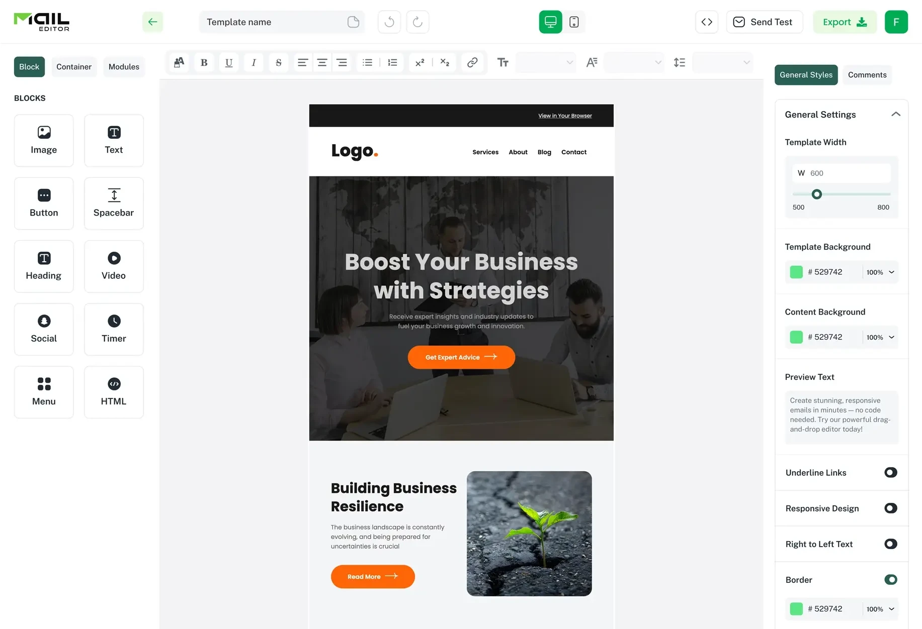
Email Design2 mins to read
Top Email Template Builders & HTML Email Editors for 2026
Compare the best email template builders and HTML editors to design professional, responsive campaigns without coding.
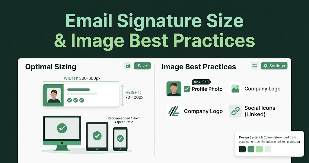
Email Design9 mins to read
Email Signature Size and Image Best Practices
The ideal email signature is 320–600px wide and 90–200px high. Learn the best image sizes, formats, file limits, and mobile-friendly design tips.

Email Tips7 mins to read
Best Drag and Drop Email Editors in 2026
Discover the best drag and drop email editors in 2026. Compare top tools, features, templates, pricing, and automation to build stunning emails fast.
Marketing7 mins to read
4 Best Unlayer Alternatives to Design Emails
Looking for Unlayer alternatives? Explore the 4 best email design tools to create beautiful, responsive emails faster and easier.
Marketing6 mins to read
5 Beefree Alternatives to Upgrade Email Design Workflows
Looking for a better email design tool? Explore 5 Beefree alternatives that streamline workflows, improve collaboration, and elevate email campaigns.