How to Improve Email Click-Through Rates
Improve email click-through rates with better targeting, clear CTAs, mobile-friendly design, and smart testing to drive more clicks and stronger engagement.

Md. Yaikub Hossain Razon
To improve email click-through rates, send relevant content to well-matched audience segments and make one primary action easy to understand. Then improve CTA copy, placement, mobile design, timing, landing-page alignment, and testing so every part of the email supports the same goal.
Email click-through rate is one of the clearest signals of active email engagement. A recipient has to do more than receive or view your message. They must decide that the next step is worth taking.
Recent benchmark data shows why context matters. MailerLite analyzed more than 3.6 million campaigns from 181,000 approved accounts. Its 2025 dataset reported an overall email click rate of 2.09%.
This guide is for marketers, ecommerce teams, agencies, SaaS businesses, newsletter publishers, and growing brands. You will learn how to measure email CTR, understand your results, improve your calls to action, and create a repeatable optimization process.
What Is Email Click-Through Rate?
Email click-through rate is the percentage of successfully delivered emails that generate at least one tracked click from a recipient.
It helps show whether an email persuaded readers to take the next action.
That action might be:
- Viewing a product
- Reading an article
- Downloading a resource
- Booking a meeting
- Starting a free trial
- Registering for an event
- Comparing plans
- Exploring a new feature
- Completing a purchase
CTR is especially useful because clicking requires an active interaction.
Apple's Mail Privacy Protection can download remote email content in the background regardless of whether the recipient actively engages with the message. This can influence open-tracking data.
Clicks, conversions, revenue, registrations, and other actions can therefore add stronger context.
For a wider view of campaign reporting, read MailEditor's guide to email marketing metrics you should track.
How Is Email CTR Calculated?
Calculate email click-through rate by dividing unique recipients who clicked by successfully delivered emails. Then multiply the result by 100.
The formula is:
Email CTR = Unique Clickers ÷ Delivered Emails × 100
For example:
- Delivered emails: 10,000
- Unique recipients who clicked: 250
- CTR: 2.5%
Calculation:
250 ÷ 10,000 × 100 = 2.5%
Use unique clickers when you want to measure the percentage of recipients who engaged.
Do not confuse unique clicks with total clicks.
One subscriber may click the same link several times. Total-click reporting may count several actions from that person.
Unique-click reporting normally counts the recipient once.
Why delivered emails matter
Suppose you send 10,200 emails.
If 200 do not reach their destination, your delivered total is 10,000.
Your CTR calculation should use the delivered audience because those are the messages that had an opportunity to generate a click.
That creates a more useful comparison between campaigns.
What Is a Good Email CTR?
A good email click-through rate depends on your industry, campaign type, audience, and previous campaign performance.
There is no single CTR target that every sender should use.
MailerLite reported a 2.09% overall click rate in its recent benchmark dataset. Ecommerce benchmarks from Omnisend show lower average campaign CTRs but substantially stronger results for automated emails.
The best approach is to compare similar emails.
Compare:
- Newsletter against newsletter
- Promotion against promotion
- Welcome email against welcome email
- Similar audience segments
- Similar campaign goals
Your own historical performance is often the most useful benchmark.
If comparable campaigns move from 1.8% CTR to 2.3%, that improvement can matter even if another industry reports a higher average.
CTR vs CTOR
CTR and CTOR measure different parts of email engagement.
|
Metric |
Formula |
What It Shows |
|
CTR |
Unique clickers ÷ delivered emails × 100 |
Engagement across the delivered audience |
|
CTOR |
Unique clickers ÷ recorded opens × 100 |
Click engagement among recorded openers |
|
Conversion rate |
Conversions ÷ selected audience base × 100 |
Results generated after engagement |
What is CTR?
CTR asks:
How many delivered recipients clicked?
It is useful for evaluating overall campaign engagement.
What is CTOR?
CTOR asks:
Among recorded openers, how many clicked?
It can help evaluate whether the email body and offer encouraged further action.
Open-tracking privacy features affect the context around CTOR.
For this reason, use CTR and CTOR alongside conversions instead of treating either metric as a complete answer.
Diagnose Your Click Path First
Before changing your email, identify which stage of the click journey deserves attention. This prevents unnecessary changes and gives every optimization a clear purpose.
Use this five-stage framework:
Reach → Relevance → Readability → Action → Outcome
1. Reach
Did the intended audience successfully receive the campaign?
2. Relevance
Does the subscriber have a clear reason to care about this message?
3. Readability
Can the reader understand the offer quickly?
4. Action
Is the next step obvious and easy to select?
5. Outcome
Does the destination continue the expectation created by the email?
Consider the sequence before changing button colors or rewriting several sections.
For example, an email sent to a broad audience may benefit more from better segmentation than a new CTA color.
An email with strong clicks but modest conversions may need closer landing-page alignment.
An email where readers select secondary links more often than the primary CTA may need clearer hierarchy.
Optimize the stage connected to the actual behavior you see.
That makes CTR improvement more systematic.
1. Segment Subscribers by Intent
Segmentation can improve email click-through rates because it lets you send content to people with a stronger reason to take the intended action.
Not every subscriber needs the same email.
Useful segmentation can be based on:
- Customer lifecycle stage
- Previous purchases
- Product interests
- Content interests
- Previous clicks
- Website activity
- Account type
- Subscription preferences
- Geographic location
- Engagement history
- Customer status
Imagine an ecommerce store launches new running shoes.
One option is sending the same message to everyone.
A more targeted option is prioritizing subscribers who previously:
- Purchased running products
- Browsed running footwear
- Clicked running-related content
- Selected running as an interest
The second audience already has context.
That makes the email more relevant before the reader reaches the CTA.
Personalize the reason to click
Useful personalization goes beyond inserting a first name.
It can change:
- Product recommendations
- Content categories
- Offers
- Images
- Geographic details
- Customer-stage messaging
- Recommended next actions
Ask this question before every campaign:
Why should this specific subscriber segment click this specific email now?
If the answer is easy to explain, the campaign has a strong relevance foundation.
2. Match Content to the Email Promise
The email body should continue the expectation created by the subject line and preview text. Readers should quickly understand what they will receive after clicking.
Think of the subject line as a promise.
The body should fulfill that promise.
For example:
Subject: 10 Product Email Templates for Your Next Launch
The email should immediately focus on those templates.
Do not open with unrelated company announcements.
Instead, lead with something like:
Build your next launch email faster with 10 ready-to-customize layouts.
Then provide the CTA.
Browse Product Templates
This creates a clean path:
Subject → Message → Benefit → CTA → Destination
Put reader value early
Compare these two approaches.
Company-first copy:
We are excited to announce several updates to our template collection.
Reader-first copy:
Create your next product campaign faster with new reusable email layouts.
The second version communicates reader value sooner.
That does not mean every sentence needs to sell.
It means the purpose should be clear.
3. Focus on One Primary Action
A campaign should have one clearly dominant primary action. Supporting links can remain, but they should reinforce rather than compete with the main goal.
An email can contain several clickable links while still having one objective.
For example, a product-launch email may include:
- Linked logo
- Linked product images
- Main CTA button
- Footer links
- Social links
Those links can coexist because the campaign still emphasizes one main action.
Problems arise when the message asks readers to make several unrelated decisions.
For example:
- Shop a product
- Download a guide
- Register for a webinar
- Read three articles
- Follow several social channels
Each request divides attention.
A clearer campaign might promote the product first.
Supporting educational content can appear in a later email.
MailEditor's guidance on conversion-focused email structure explains how layout, messaging, and CTA hierarchy work together.
Repeat the same CTA when useful
Long emails do not need only one physical button.
You can repeat the same primary action at logical points.
For example:
View the Collection
could appear after the introduction and again after product examples.
The goal stays consistent.
4. Write Better CTA Copy
Effective CTA copy tells readers what happens next. Use specific action-oriented wording that describes the destination or benefit.
Compare these examples:
|
Generic CTA |
More Descriptive CTA |
|
Click Here |
View the Collection |
|
Learn More |
See How It Works |
|
Submit |
Get My Guide |
|
Continue |
Compare the Plans |
|
Go |
Browse Templates |
|
Read |
Read the Full Guide |
|
Start |
Start Building Free |
|
View |
View Pricing Options |
Specific wording reduces uncertainty.
Start with a useful verb
Strong CTA verbs include:
- View
- Browse
- Explore
- Compare
- Download
- Build
- Start
- Read
- Reserve
- Watch
- Discover
- See
Then explain the destination.
For example:
Browse Free Email Templates
is more informative than:
Click Here
Match CTA language to intent
CTA wording should also reflect where the reader is in the buying journey.
For an educational email:
Read the Complete Guide
may fit.
For a product-discovery email:
Explore the Collection
may fit.
For a ready-to-act user:
Start Building Your Email
may fit.
The CTA should feel like the natural next step.
5. Improve CTA Placement
Place the primary CTA when the reader has enough information to understand why clicking is worthwhile. Simple offers can show the CTA early, while considered decisions may need more context first.
There is no universal rule that every CTA must appear at an exact pixel position.
Instead, ask:
Does the reader understand the offer before reaching the button?
A simple campaign could use:
Headline → short benefit → CTA
A more detailed campaign might use:
Headline → explanation → proof → CTA
Give the primary CTA visual priority
The main button should be easier to identify than secondary actions.
You can create priority through:
- Placement
- Surrounding whitespace
- Button size
- Contrast
- Short copy
- Consistent repetition
- Clear section structure
Avoid surrounding the primary CTA with several equally prominent actions.
Readers should recognize the intended next step within seconds.
6. Make Buttons Easy to Tap
Email CTA buttons should be comfortably tappable on mobile devices and easy to distinguish from nearby elements.
Many subscribers interact with email using a thumb rather than a mouse pointer.
That changes design priorities.
W3C's enhanced target-size guidance recommends custom pointer targets of at least 44 by 44 CSS pixels, with documented exceptions.
For marketing emails, treat this as a useful accessibility reference rather than a reason to make every button oversized.
Your CTA should have:
- Comfortable vertical padding
- Clear button text
- Enough surrounding space
- Strong text contrast
- Separation from nearby links
- A sufficiently large clickable area
Also make the entire visual button clickable whenever your email implementation supports it reliably.
Do not make subscribers precisely select a tiny piece of text inside a large visual button.
7. Strengthen Visual Hierarchy
Visual hierarchy shows readers what to notice first, what to read next, and where to take action.
A practical email hierarchy could be:
- Brand recognition
- Main headline
- Supporting benefit
- Primary CTA
- Additional details
- Supporting proof
- Repeated primary CTA
- Footer
The reader should not have to search for the main message.
Use whitespace intentionally
Whitespace gives important elements room to stand out.
Place enough space around:
- Headlines
- CTA buttons
- Product blocks
- Images
- Paragraph groups
A crowded layout makes several elements compete for attention.
A well-spaced layout guides the eye more naturally.
Use color to reinforce priority
There is no universal CTA color that guarantees higher CTR.
The better approach is choosing a CTA color that:
- Fits your brand
- Stands apart from its surroundings
- Keeps button text readable
- Remains easy to identify
- Works across light and dark environments
MailEditor's guide to choosing email colors that convert explains how contrast, branding, accessibility, and CTA visibility work together.
8. Design for Mobile Readers
Mobile-friendly email design supports clicks by keeping content readable and actions comfortable on narrower screens.
Design for the smallest practical reading environment first.
Use:
- A clear single-column flow
- Responsive images
- Readable text
- Short content blocks
- Comfortable spacing
- Large CTA areas
- Clear section separation
- Limited competing actions
Avoid relying on small inline text links as the campaign's primary action.
A main CTA button is easier to recognize on a touchscreen.
Check the reading order
Desktop designs can sometimes place content side by side.
On mobile, those columns often stack.
Make sure the stacked order still makes sense.
For example:
Image → product name → benefit → CTA
is usually clearer than:
CTA → image → unrelated text → product name
Review MailEditor's mobile-responsive email design best practices when building layouts that need to work across screen sizes.
9. Keep Email Content Scannable
Subscribers should be able to understand the purpose of an email even when they scan rather than read every sentence.
Use:
- Short paragraphs
- Descriptive headings
- Clear benefits
- Bullets where useful
- Focused images
- Consistent CTA wording
- Logical section order
One paragraph should usually communicate one main idea.
Long uninterrupted blocks increase reading effort.
Remove unnecessary steps
Before sending, review every section.
Ask:
Does this section help the reader understand or take the primary action?
If the answer is no, consider moving it elsewhere.
This does not mean every email must be extremely short.
Length should match the decision.
A newsletter may contain several useful sections.
A flash promotion may need only a headline, product image, offer, and CTA.
A detailed B2B offer may need explanation before the click.
Use the minimum amount of content needed to make the next decision clear.
10. Match the Landing Page
The destination after the click should continue the same offer, wording, product, and expectation established inside the email.
The email click is a transition.
It is rarely the final business objective.
Suppose an email says:
Download the 2026 Ecommerce Email Checklist
The destination should immediately present that checklist.
Readers should not need to search through a general resources page.
Maintain message match
Keep these elements aligned:
- Main headline
- Product
- Offer
- Discount
- Price
- Image
- CTA
- Promotion terms
- Destination
For example:
Email CTA: Browse Free Email Templates
The destination should lead directly to the relevant template library.
MailEditor offers 200+ responsive HTML email templates for newsletters, promotions, ecommerce, onboarding, transactional emails, events, and other campaign types.
That connection gives users exactly what the CTA describes.
11. Use Behavioral Timing
Email timing becomes more useful when it reflects subscriber intent or recent actions rather than relying only on a universal sending hour.
Behavior-based campaigns include:
- Welcome emails
- Browse follow-ups
- Cart reminders
- Product education
- Post-purchase messages
- Renewal reminders
- Event reminders
- Back-in-stock notifications
The key is choosing timing that fits the campaign.
For scheduled broadcasts, MailEditor's guide to the best time to send email campaigns provides practical starting windows and a structured testing approach.
12. A/B Test One Variable at a Time
A useful email A/B test changes one important variable while keeping other conditions as similar as possible.
Good CTR tests include:
- CTA wording
- CTA position
- Email length
- Hero layout
- Product order
- Personalization
- Send time
For example:
Version A: Shop Now
Version B: Explore Running Shoes
Keep the rest of the email consistent.
Then measure:
- Unique CTR
- Conversions
- Revenue
- Registrations
- Purchases
A higher CTR is useful, but the winning version should also support the campaign’s real objective.
Measure Meaningful Clicks
CTR tells you that someone clicked. It does not automatically tell you whether the click produced the desired business outcome.
Measure CTR alongside downstream metrics.
Depending on your campaign, track:
- Conversion rate
- Purchases
- Revenue
- Revenue per recipient
- Trial starts
- Registrations
- Downloads
- Form submissions
- Booked calls
- Account activations
Imagine two campaigns.
|
Campaign |
CTR |
Purchase Rate |
|
Campaign A |
3.2% |
0.5% |
|
Campaign B |
2.7% |
0.9% |
Campaign A generated more clicks.
Campaign B generated a higher purchase rate.
If sales were the objective, Campaign B may provide more useful direction.
This is why your campaign goal should determine the metric you prioritize.
Review Automated Click Activity
Some security and email-protection systems inspect links automatically.
Depending on your email platform and reporting method, those automated checks can sometimes appear within click data.
Use your platform's filtering options when available.
You can also review unusual patterns.
Examples include:
- Many links activated almost simultaneously
- Every tracked link receiving identical activity
- Click patterns inconsistent with later site behavior
Do not remove legitimate clicks simply because they look unusual.
Instead, understand how your sending platform handles automated activity.
Consistent measurement rules make campaign comparisons more useful.
Email CTR Diagnosis Table
|
What You See |
Review This |
First Action |
|
Delivery is steady, clicks are lower |
Relevance |
Review segmentation |
|
Opens are strong, clicks are lower |
Message and CTA |
Improve alignment |
|
Secondary links receive more clicks |
CTA hierarchy |
Strengthen primary CTA |
|
Mobile clicks trail desktop |
Mobile design |
Review spacing and buttons |
|
Clicks are strong, conversions are lower |
Landing page |
Improve message match |
|
One segment performs better |
Targeting |
Create more focused segments |
|
Tests produce unclear results |
Test structure |
Change one variable |
The important principle is simple:
Do not change everything at once.
Find the part of the click path that has the clearest opportunity.
Then test the most relevant improvement.
A Practical CTR Optimization Workflow
Use this process for your next email campaign.
Step 1: Set the campaign goal
Choose one main objective.
For example:
Generate visits to the new product collection.
Step 2: Define the primary CTA
Example:
Explore the New Collection
Step 3: Choose the relevant segment
Select subscribers most likely to value the message.
Step 4: Build the email around the action
Use the headline, copy, images, and layout to support the same goal.
Step 5: Check mobile usability
Review text size, image scaling, CTA size, spacing, and stacked content.
Step 6: Confirm every link
Make sure each important link points to the correct destination.
Step 7: Send the campaign
Keep the audience and timing appropriate for your testing plan.
Step 8: Measure the result
Record:
- Delivered emails
- Unique clickers
- CTR
- Main CTA clicks
- Conversion rate
- Revenue or campaign outcome
Step 9: Identify one opportunity
Choose the next variable based on behavior.
Step 10: Test again
Repeat the process with one controlled change.
Over time, you create a campaign history based on evidence rather than assumptions.
How MailEditor Helps Build Click-Focused Emails
A strong click path depends partly on how clearly the email presents its content and primary action.
MailEditor's drag-and-drop HTML email builder lets you create, import, customize, reuse, and export HTML email designs visually.
You can adjust:
- CTA buttons
- Images
- Text
- Sections
- Columns
- Spacing
- Colors
- Layouts
- Reusable modules
- Custom HTML blocks
This makes it easier to keep the campaign structure focused while refining the elements that influence how readers interact with the email.
Start with one clear objective.
Build the content hierarchy around that objective.
Then test the finished campaign using real subscriber behavior.
Frequently Asked Questions
Question: How do I increase email click-through rate?
Answer: Increase email click-through rate by improving audience relevance, focusing the campaign on one primary action, writing clear CTA copy, optimizing the mobile experience, and testing one meaningful change at a time.
Question: Does mobile design affect email clicks?
Answer: Yes. A responsive layout can make text easier to read and CTA buttons easier to tap on smaller screens.
Question: How many CTAs should an email have?
Answer: Most campaign emails benefit from one dominant primary action, although that same action can appear more than once.
Question: Where should an email CTA appear?
Answer: Place the primary CTA when the reader has enough information to understand the value of clicking.
Final Answer
To improve email click-through rates, make every stage between delivery and destination clearer and more relevant.
- Start with the audience.
- Send content that matches subscriber interests, behavior, or lifecycle stage.
- Then give the email one dominant objective.
- Use descriptive CTA copy, clear visual hierarchy, comfortable button areas, and responsive mobile design.
- Next, make sure the landing page continues the promise made inside the email.
- Finally, measure the outcome and test one meaningful improvement at a time.
Remember this sequence:
Reach → Relevance → Readability → Action → Outcome
Industry benchmarks can show where your campaign sits today.
Your own comparable campaign history shows whether your email program is moving in the right direction.
When you are ready to build the campaign, use MailEditor to create a responsive email, keep the CTA visually clear, and turn your findings into the next controlled improvement.
Popular Blogs
Email Design2 mins to read
Top Email Template Builders & HTML Email Editors for 2026
Compare the best email template builders and HTML editors to design professional, responsive campaigns without coding.
Email Design9 mins to read
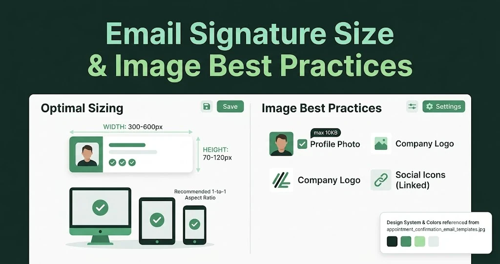
Email Signature Size and Image Best Practices
The ideal email signature is 320–600px wide and 90–200px high. Learn the best image sizes, formats, file limits, and mobile-friendly design tips.

Email Tips7 mins to read
Best Drag and Drop Email Editors in 2026
Discover the best drag and drop email editors in 2026. Compare top tools, features, templates, pricing, and automation to build stunning emails fast.

Marketing7 mins to read
4 Best Unlayer Alternatives to Design Emails
Looking for Unlayer alternatives? Explore the 4 best email design tools to create beautiful, responsive emails faster and easier.

Marketing6 mins to read
5 Beefree Alternatives to Upgrade Email Design Workflows
Looking for a better email design tool? Explore 5 Beefree alternatives that streamline workflows, improve collaboration, and elevate email campaigns.