Email Header Examples: Layouts, Branding & HTML
Explore 8 email header examples with branded layouts, design tips, and copy-ready HTML. Customize professional email headers with MailEditor.

Md. Yaikub Hossain Razon
The best email header examples use a recognizable logo, focused navigation, and enough spacing to make the brand clear without distracting from the message. Your header may be a single logo, a short menu, or a campaign-focused design, depending on the email’s goal.
This guide compares eight practical layouts, including five original MailEditor module designs and three illustrative concepts. You will see when to use each layout, how to customize it, and how to build a responsive header with HTML.
Quick answer: For most marketing emails, start with a recognizable logo and a clean, mobile-friendly header. Add a short navigation row, social links, or a promotion only when those elements help the email accomplish its purpose. A 600px-wide content area is a practical starting point, but the header should scale down on phones.
What Is an Email Header?
In email design, the visual header is the first branded area inside an opened email. It may contain a company logo, short navigation links, a tagline, social icons, a campaign label, or a call to action. A header can be as small as a centered logo or as expressive as a branded newsletter masthead.
That is different from an email's technical message headers, such as From, To, Date, Subject, and routing fields. This article focuses on the visual HTML header readers see inside the email; not the hidden delivery metadata.
The key is to match the layout to the message. A receipt or account notification benefits from restraint; a retail promotion may need a stronger visual cue. There is no single header design that suits every campaign.
5 MailEditor Email Header Modules You Can Customize
These five MailEditor screenshots show genuine module designs. The original module images are unchanged. Each Use Module button takes you to the MailEditor dashboard, where you can sign in and browse available header sections.
Register for free to access MailEditor, customize a reusable header module, and start building your email. Already have an account? Browse the modules and sign in when prompted.
1. Dark Background Header with Navigation
Best for: Brand-led ecommerce campaigns and newsletters with a strong identity.
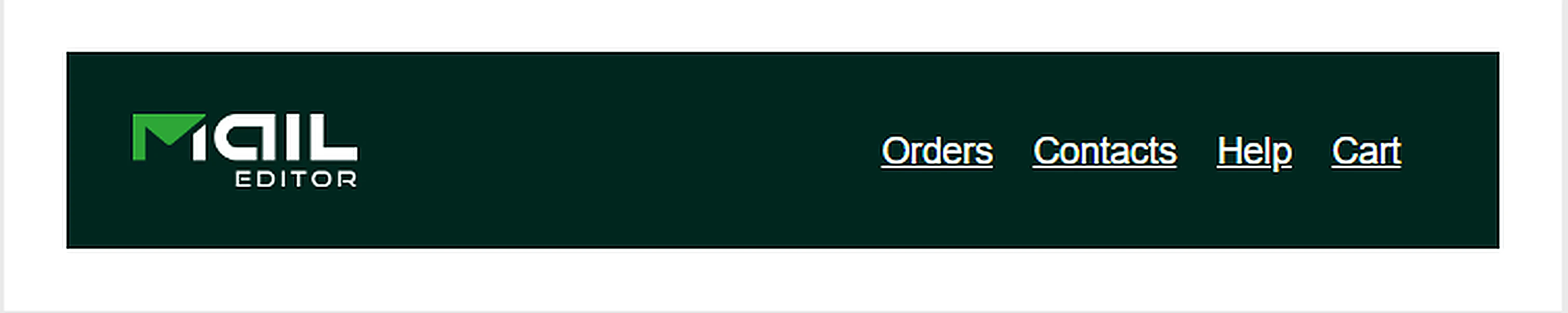
Why it works: A deep background separates the header from the email body, while a contrasting logo and a small set of links help readers recognize the brand and browse quickly.
Customize it: Replace the logo and links, preserve strong color contrast, and reduce the number of destinations on mobile. Use labels that match your actual store or customer journey.
2. Light Background Logo and Navigation Header
Best for: Retail updates, new arrivals, and regular promotional emails.
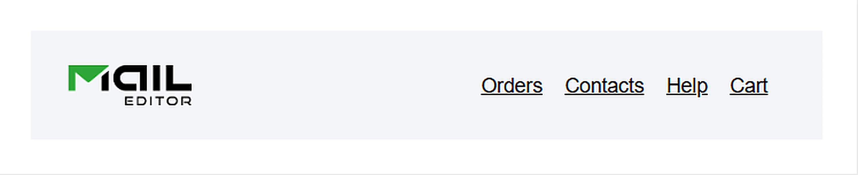
Why it works: The light canvas leaves space around the logo and keeps the header quiet, letting product photography or the campaign headline become the focal point below.
Customize it: Swap in a high-resolution logo, align navigation labels to the most useful destinations, and check text legibility against the light background.
3. Two-Row Email Header with Account Link
Best for: Account updates, membership emails, and customer-service-heavy ecommerce messages.
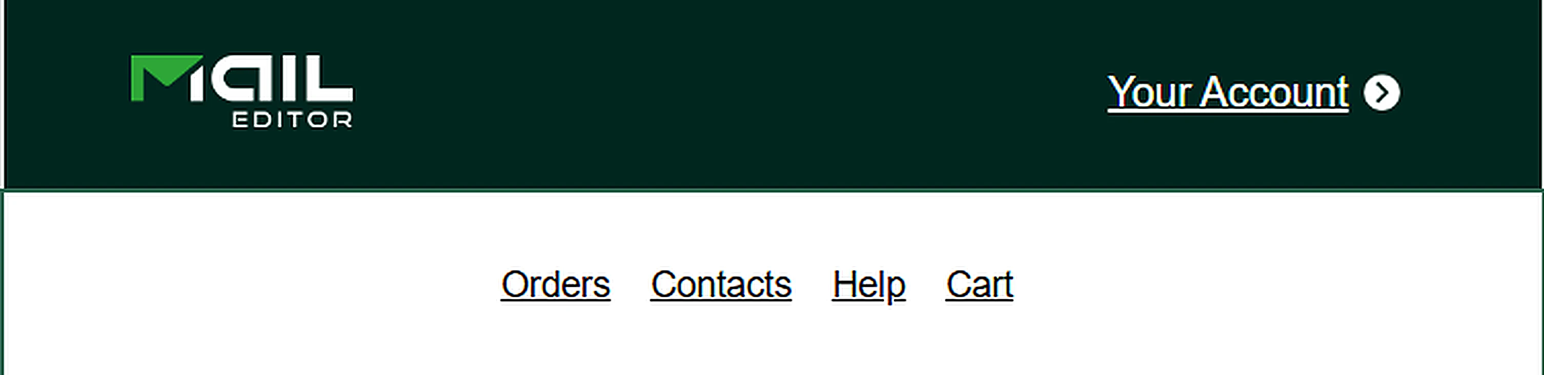
Why it works: Separating the account destination from secondary navigation creates a clear hierarchy without squeezing every action into a single line.
Customize it: Make the account action destination obvious, keep secondary links short, and test the combined height on a narrow screen.
4. Logo Header with Social Media Icons
Best for: Creator newsletters, community announcements, and social-first brands.

Why it works: The social icons provide a secondary discovery path while the logo remains the main brand cue.
Customize it: Link only to active, relevant social profiles. Add accessible labels to linked icons in the actual HTML and avoid making icons so small that tapping is difficult.
5. Minimal Centered-Logo Header
Best for: Transactional messages, personal updates, and minimalist brand communications.

Why it works: With no competing navigation, the message content gets attention quickly and the brand remains identifiable.
Customize it: Replace the logo, adjust whitespace thoughtfully, and keep any essential destination in the message body rather than adding unnecessary header links.
3 More Email Header Design Ideas
Beyond the five MailEditor module designs, these three examples explore different visual directions for promotions, newsletters, and events. Use the ideas to plan a header that fits your campaign and audience.
6. Promotional Header with a Clear CTA
Best for: Flash sales, seasonal offers, and product-launch announcements.

Click the image to open the full-size preview.
Why it works: A visible offer and one primary action make the purpose clear. Here the headline, supporting copy, and button work together rather than compete.
Customize it: Replace the sample brand, offer, and CTA with accurate campaign details. Build the button as live HTML whenever possible instead of relying on the mockup as one flattened image.
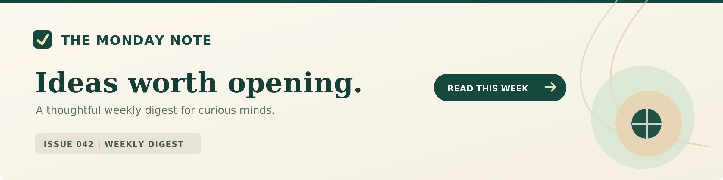
7. Editorial Newsletter Masthead
Best for: Weekly digests, thought-leadership updates, and editorial publications.
Click the image to open the full-size preview.
Why it works: The publication name, issue number, and recurring visual style create familiarity across sends while making the current edition easy to identify.
Customize it: Keep the masthead consistent and update the issue label and teaser each time. Use readable live text for the issue number and headline.
8. Event Invitation Header
Best for: Webinars, workshops, product demos, and event registration emails.
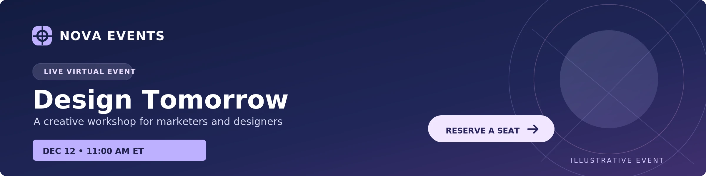
Click the image to open the full-size preview.
Why it works: The event name, format, timing, and registration action are visible at a glance, helping readers assess relevance quickly.
Customize it: Replace the illustrative event details with your confirmed date, time zone, and registration URL. If you use a graphic, repeat the essential details in selectable HTML text.
Which Email Header Layout Should You Choose?
Choose a header based on the email's goal, not how much space you can decorate. The most useful layout is the one that makes the sender and next action obvious.
| Header layout | Good for | Watch out for |
|---|---|---|
| Minimal centered logo | Receipts, updates, simple announcements | Excess whitespace or a logo too small to recognize |
| Logo + short navigation | Retail newsletters and product updates | Too many tiny links on mobile |
| Two-row header | Account and customer-service emails | Header height pushing the message too far down |
| Logo + social icons | Community and creator newsletters | Links that distract from the email's primary objective |
| Promotional header | Sales and launches | Image-only headlines, misleading offer language |
| Editorial or event masthead | Digests, webinars, invitations | Essential details trapped inside artwork |
A simple rule: if removing a header element makes the next action clearer, that element probably belongs later in the message; or not at all.
Email Header Design Best Practices
Make branding recognizable in seconds
Use a consistent logo treatment and a small set of brand colors. Provide clear space around your mark and avoid placing it on a background that weakens contrast. When possible, use a logo file that stays legible in both light and dark surroundings.
Keep navigation focused
Two to four short destinations are often more usable than a full website menu. Favor links that serve the campaign, such as Shop, New Arrivals, Support, or My Account. For simple transactional messages, navigation may be unnecessary.
Build for narrow screens first
Readability matters more than squeezing in desktop navigation. Keep tap targets comfortably separated, make text large enough to read without zooming, and check whether the header wraps or stacks gracefully. A single-column logo-and-links arrangement is an uncomplicated fallback.
Use live text for important information
A screenshot can inspire a header, but a production email should not depend on images to communicate critical offers, dates, or destinations. Put the actionable text and links in HTML, use meaningful image alt text, and confirm the message still makes sense with images disabled.
Test dark mode, image blocking, and multiple inboxes
Email clients vary in their rendering of CSS, image dimensions, background colors, and dark mode. Preview your finished message in the inboxes your audience uses; check Gmail and Outlook variants on desktop and mobile rather than assuming one browser preview represents every inbox. Dark-mode color inversion can affect logos and contrast.
For broader small-screen guidance, see our mobile-responsive email design guide. Developers working with more complex layouts can also review our HTML email media queries examples.
What Is the Best Email Header Size?
Size guide: A practical starting point is a 600px-wide email content area. A compact logo-only header might be about 80-150px tall, while a standard branded header often fits in roughly 150-200px. Promotional designs may be taller. These are design ranges, not hard technical requirements.
If a header image will display at 600 × 200px, preparing a 1200 × 400px version can look sharper on high-density screens; provided the HTML constrains the display size and the file is optimized. Use responsive width styles so the email fits the available screen.
For fuller size recommendations, hero-image guidance, and export examples, see MailEditor's Email Banner Size guide. Keeping dimensions in that dedicated guide prevents this article from repeating a separate search intent.
How to Create a Responsive HTML Email Header
For a broadly compatible starting point, use a presentation table, inline CSS, a linked logo with useful alt text, and a short row of actual HTML navigation links. A single-column layout is easy to scale down without relying on advanced CSS. The example below is intentionally simple and includes a sample body row so you can paste it into an HTML file and preview it.
- Choose a readable header structure (logo-only or logo with two to three links).
- Prepare your logo at a suitable resolution and host it on a public HTTPS URL.
- Use inline styles and a fluid outer table with a maximum content width.
- Replace all example links, image paths, and sample text.
- Preview on mobile and send test emails to the clients your subscribers use.
Copy-Ready HTML Email Header Code
These three table-based HTML email header examples offer practical starting points for different campaign needs. Choose a simple branded layout, an ecommerce header, or a newsletter masthead. Select Preview to view the rendered header, then select Show Code to return to the compact, scrollable HTML. Copy Code copies the full HTML in either view.
The code panels are scrollable to keep the article compact. Replace all example.com links and demo brand details before using the HTML in a real campaign.
1. Simple Branded Header with Navigation
A clean, centered logo and three links for everyday campaigns and transactional-style messages. The logo URL in the copyable HTML is a placeholder; this preview uses a text brand label instead.
2. Advanced Ecommerce Header with Promo Strip
A two-level store header with an account link, mobile-friendly navigation, a delivery announcement, and a prominent campaign action.
3. Editorial Newsletter Header with Issue CTA
A distinctive newsletter masthead with an issue label, clear editorial typography, and one primary reading CTA.
Customize the HTML before sending
- Replace all
example.comlinks with real, working destinations. - For the simple header, replace
https://example.com/your-logo.pngwith a public HTTPS logo URL and update the logo alt text. - For the ecommerce and newsletter headers, replace the sample names, promotions, issue details, colors, and CTA destinations.
- Keep important copy and links as selectable HTML, not a single flattened image.
- Preview on mobile, verify accessible text and navigation, and send test emails to your target email clients.
How to Build a Reusable Email Header in MailEditor
You do not have to code the same header from scratch for every campaign. The MailEditor Module Builder offers reusable email sections, including header modules. The visual editor lets you assemble modules and edit their text, logos, links, and design.
- Open MailEditor and choose a template or blank email.
- Browse the module library and find a header style that fits the message.
- Add the header to the email and replace the sample logo, links, and branding.
- Arrange the remaining sections; hero, content, CTA, and footer; underneath it.
- Preview, test, and export the completed email for your sending workflow.
If you are new to modular creation, the MailEditor modules walkthrough explains how these reusable blocks fit together. You can also explore ready-made email templates if you need a complete campaign layout rather than a single header.
Turn these header ideas into your own email
Choose a reusable header, apply your branding, and keep designing in MailEditor.
Browse Email Modules →Looking for the full editor? Explore the MailEditor email editor.
Common Email Header Mistakes to Avoid
- Overloading navigation: a crowded row is especially hard to use on a phone.
- Using an oversized logo: a tall header can hide the main message below the first screen.
- Flattening the full header into one image: image blocking can remove important text or calls to action.
- Ignoring alt text and accessible labels: linked icons need a clear purpose beyond their visual shape.
- Choosing poor contrast: test both normal and dark-mode appearances.
- Forgetting link QA: verify every menu item, account destination, and campaign button before sending.
- Copying a screenshot as the production design: use screenshots as examples; create actual HTML elements for reliable interaction.
Final Answer
The best email header is the simplest branded layout that supports the message. Start with a recognizable logo, add only useful links, and make sure the design remains readable on mobile. Choose a minimal header for straightforward updates, navigation for ecommerce, or a promotional or editorial masthead when the campaign benefits from more context.
The five original MailEditor module examples above offer starting points for reusable headers, while the additional three designs illustrate promotional, newsletter, and event use cases. For a working implementation, customize the HTML starter or browse reusable MailEditor modules and test the full email before sending.
Frequently Asked Questions
Popular Blogs
Email Design2 mins to read
Top Email Template Builders & HTML Email Editors for 2026
Compare the best email template builders and HTML editors to design professional, responsive campaigns without coding.
Email Design9 mins to read
Email Signature Size and Image Best Practices
The ideal email signature is 320–600px wide and 90–200px high. Learn the best image sizes, formats, file limits, and mobile-friendly design tips.

Email Tips7 mins to read
Best Drag and Drop Email Editors in 2026
Discover the best drag and drop email editors in 2026. Compare top tools, features, templates, pricing, and automation to build stunning emails fast.
Marketing7 mins to read
4 Best Unlayer Alternatives to Design Emails
Looking for Unlayer alternatives? Explore the 4 best email design tools to create beautiful, responsive emails faster and easier.
Marketing6 mins to read
5 Beefree Alternatives to Upgrade Email Design Workflows
Looking for a better email design tool? Explore 5 Beefree alternatives that streamline workflows, improve collaboration, and elevate email campaigns.