Best Practices for Designing Emails That Convert
Best practices for designing emails that convert, from layout and visuals to CTAs and mobile optimization that drive clicks and sales.

Shahin Alam
A common problem with running email campaigns is that the majority of emails don’t convert. This is despite of modern benefits, which include teams not being short on tools, editors being faster than ever before, and templates being easier to manage. Despite all of these conveniences, conversion remains few and far between.
I have worked on emails that looked perfectly fine by every internal standard. They had clean layouts, sensible copies, and no obvious mistakes. They passed reviews quickly, yet still underperformed. I know how frustrating it is.
The issue here is not effort. It is judgment, and especially early judgment.
Over time, as I watched enough campaigns stall, I started noticing a pattern. Teams followed what they believed were the best practices for designing emails, but they followed them without thinking about the actual moment an email gets opened. The reality is that that moment matters more than most design rules.
People do not open emails calmly. They skim. They pause. They decide fast whether something deserves another second of their attention. The email design either helps that decision along, or quietly works against it.
This article is about those quiet decisions. The ones that rarely show up in checklists, but tend to shape whether your email converts or not.
Key Takeaways
- Emails fail more due to timing and context than because of bad ideas
- Structure usually matters more than visual appeal
- Clear hierarchy beats clever layout choices
- Fewer actions per email lead to cleaner results
- Design should ease things for the reader, not make it more interesting
The Best Practices for Designing Emails Consider the Moment They Are Opened

When you work inside an editor, everything feels controlled. You work on a big screen with minimal distractions. You have plenty of time to finetune spacing and alignment. In this environment, it is easy to forget that once the email leaves your hands, it leaves this comfort zone as well.
Once an email is sent, the most opens happen in awkward moments. Moments such as between meetings, sipping coffee, or while waiting for something else to start. That context changes how design works.
In other words, if an email is designed to demand the reader’s patience, it has already lost.
I learned this the hard way on a product update campaign a few years back. The layout looked balanced and thoughtful on desktop. But on mobile, it felt slow. Not broken. Just slow. The clicks dropped without a clear reason until we simplified the structure and moved up the main action.
Context beats clever design
Today, the majority of emails are opened on mobile phones or tablets, often with divided attention. Readers nowadays don’t study layouts. They scan for a reason to continue reading.
If you want your email to convert, your design needs to align with this reality. Include clear entry points and obvious emphasis. Keep it free of anything that forces the reader to have to think and figure out where to look next. As I mentioned before, readers open emails with divided attention, and if your email makes them hesitate or stop to think, it will cost you clicks.
MailEditor has a solid post on common email mistakes that beautifully explains how small layout decisions disrupt the reader’s experience. If you have a minute, go through it; it will help you understand that loss in conversion often comes from friction, not lack of creativity.
Designing emails for skimming, not in-depth reading
The common practice with emails is that most people skim through the whole thing in seconds. This is evident in research, as studies have found that the average read time for promotional emails is around nine to eleven seconds. The scroll depth usually stops early on unless your email design has something that pulls the reader’s eye forward.
This is where hierarchy does the real work. The headlines need to earn their position. The buttons should feel expected, not hidden. The space should guide your reader’s movement instead of just filling gaps.
In other words, you should design emails for the skim first. Reading comes later, if at all.
Design Choices That Push Readers Toward Action

Once you accept the fact that most readers are distracted, your design stops being decorative. It becomes directional.
The goal here is not to impress your reader. It is to remove the moments where someone has to stop and think about what happens next. These pauses add up and mar the experience.
In my opinion, some of the most effective changes feel almost boring when described. Do simple things like moving something up, adding a bit more space, or removing one element. Even though they are small changes, they compound and have a bigger impact than you might think.
Buttons are not magic, placement is

Buttons often get blamed for everything. Color. Shape. Copy. Those details matter, of course, but the placement matters more.
In multiple tests I have seen, moving a primary button into the first visible section of an email increased clicks significantly. Even though the email had the same content and the same wording, just a small positional change made a massive difference.
The spacing matters, too. If you design a button that is pressed tightly against text, it will compete for the reader’s attention. As we know by now, this is a huge drawback in email campaigns and designs, and hamper conversion rates.
Whitespace does more work than your copy
Crowded emails ask too much of the reader. Multiple messages. Tight margins. Too many images stacked together. The result is hesitation.
Enter whitespace. It creates breathing room and tells readers where to pause and what deserves attention. In practice, emails with clearer spacing often show longer scroll time and fewer abrupt exits.
Yes, you show less on the screen. But what remains actually gets seen. And that is imperative for better conversion.
The Best Practices for Designing Emails Ensure Teamwork Between Content and Design

If your email design and copy pull in different directions, they are bound to fail.
I have seen strong copies underperform because they were visually buried. Things like important lines placed too low, or supporting text given more weight than the main message. Images can steal attention without adding any real meaning to an email.
Your readers follow visual cues before they read sentences. If the layout highlights the wrong element, the message weakens, and conversion takes a hit. The lesson here? The copy did not fail. The emphasis did.
A bad layout brings down even good copies
In one onboarding email I worked on, the most important sentence was halfway down the screen. The header image above it was attractive, but unnecessary. The moment I removed that image and lifted the copy, the clicks increased.
In other words, your email design should guide attention in the same direction the words are already pointing. Nothing more, nothing less.
Design around one primary action per email
Another common pitfall of email designs is that many emails try to do too much. It asks the reader to read this, click that, follow here, and learn more there.
Multiple calls to action feel helpful at first glance, but in reality, it usually dilutes focus. When everything is an option, the urgency disappears. This weakens conversion.
In contrast, emails built around one clear action tend to convert better. This is because these emails make the reader’s decision simpler. One message. One next step. Everything else supports that choice.
Consistency Builds Trust Faster Than Visual Flair

It’s tempting to chase novelty. New layout, new button style, new way to stack content “just to try something different.” And sometimes that works. But more often, what actually moves readers is familiarity. Not boredom. Recognition.
When someone opens an email and instantly knows where to look, how to scroll, and what matters most, they relax. That sounds small, but it’s not. A relaxed reader is more likely to act. They’re not decoding the layout. They’re absorbing the message.
Consistency doesn’t mean every email looks identical. It means the rules stay steady. Headlines behave the same way. Buttons don’t suddenly migrate to odd corners. Spacing doesn’t change dramatically from one send to the next. Over time, readers learn your patterns, even if they can’t explain them.
You can see this shows up in data. Emails that stick to a familiar structure often get steadier click rates, even when the content changes. Not spikes. Stability. And in email, stability compounds.
This is where design restraint matters. A subtle tweak to hierarchy or spacing usually performs better than a full redesign. Especially for audiences that open your emails weekly, sometimes daily. They’re not looking to be impressed. They’re looking to get in, get the value, and move on.
Flash wears off. Predictability, when done well, quietly earns trust.
Trust doesn’t come from flashy design. It’s built through consistent branding, structure, and messaging your audience recognizes.
How Common Email Design Choices Affect Conversion

Design sends signals before a single word is read. The table below shows how those signals often show up in real campaign results.
| Design choice | What it signals to readers | Typical impact on clicks or engagement |
| Single primary CTA | Clear direction | Clicks cluster around one action |
| Generous spacing | Low effort to process | Better scroll depth and dwell time |
| Button near key message | Action feels immediate | Faster clicks, less hesitation |
| Multiple CTAs | Too many decisions | Lower clicks per action |
| Dense content blocks | High effort required | Early drop off |
Real Email Performance Is Shaped After the Send, Not Before

Most design discussions stop right before launch. The template is ready, the copy is approved, and everyone moves on. But that’s not where the real learning happens.
The useful part starts after the email lands.
What did people actually click, not what you hoped they would? Did they scroll past the first section or stall there? Did mobile readers behave differently than desktop ones, again? These answers don’t usually come from one dramatic insight. They show up in small patterns, repeated over time.
This is also where assumptions get uncomfortable. A section you fought to keep might get ignored. A plain link buried lower than expected might quietly outperform your main button. It happens more than teams like to admit.
The mistake is reacting too fast or not at all. One send doesn’t prove much. Five sends start to whisper something useful. Ten sends usually make it clear.
Designing emails with this mindset changes how you work. You stop treating each campaign as a one-off and start thinking in versions. Small changes. Controlled adjustments. Fewer emotional decisions.
It’s not glamorous. It’s closer to tuning than reinventing. But this is how email programs actually improve. Not through bold declarations of best practices, but through patient attention to what readers keep doing, even when no one is watching closely.
Tools Do Not Convert Emails, But They Shape How Fast You Learn

It is tempting to credit wins to tools. A new editor. A cleaner template. A smoother workflow. Tools rarely create conversion on their own. What they change is how quickly teams can learn.
Slow workflows hide problems. When editing takes hours, teams avoid testing small ideas. They ship safe versions and move on. Over time, that caution limits improvement.
Faster feedback changes behavior.
Why editing speed affects conversion quality
Conversion improves through iteration. Small changes to spacing, order, or emphasis often make the difference, but only if they are easy to test.
Teams that can adjust and resend quickly notice patterns sooner. They see when moving a button helps or when shortening a layout keeps readers scrolling. Those insights compound over time. When editing is slow, learning slows too.
Where visual editors help and where they don’t
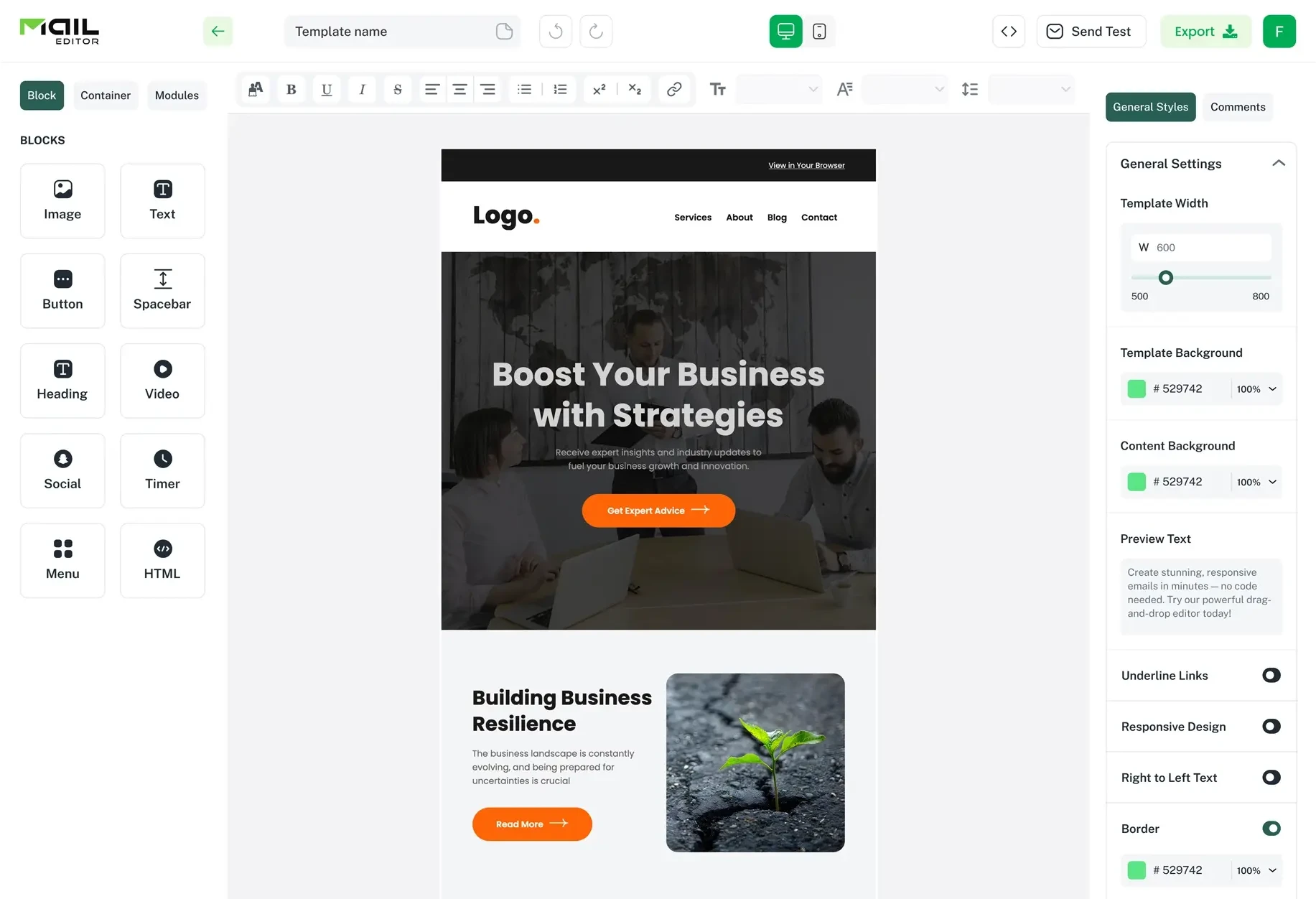
Visual editors remove a specific barrier. They make layout changes possible without touching raw HTML. That matters when time is tight or when more than one person needs to make changes.
Tools like MailEditor help teams adjust structure and spacing without breaking emails. That speed supports experimentation.
What tools cannot do is decide what to test or why. Your judgment still carries the weight.
Conclusion
Email design often drifts toward rigid rules. Do this. Avoid that. Follow the checklist. Real campaigns do not behave so neatly.
The best practices for designing emails are working assumptions, not permanent truths. They hold until reader behavior shifts. And it always does.
What keeps emails converting is attention. Watching where people pause. Noticing where they stop scrolling. Seeing which changes remove friction and which quietly add it back.
Most improvement comes from restraint. Fewer messages. Clearer structure. More space to think. Those choices rarely feel dramatic, but they stack over time.
Eventually, that steady judgment matters more than any single layout ever will.
Written by
A full-stack digital marketer and passionate blogger with more than seven years of hands-on experience helping brands grow, rank, and thrive online.
All postsPopular Blogs
Email Design2 mins to read
Top Email Template Builders & HTML Email Editors for 2026
Compare the best email template builders and HTML editors to design professional, responsive campaigns without coding.

Email Tips7 mins to read
Best Drag and Drop Email Editors in 2026
Discover the best drag and drop email editors in 2026. Compare top tools, features, templates, pricing, and automation to build stunning emails fast.

Marketing7 mins to read
4 Best Unlayer Alternatives to Design Emails
Looking for Unlayer alternatives? Explore the 4 best email design tools to create beautiful, responsive emails faster and easier.
Email Design1 min to read
How to Create an HTML Email Template in Mailtrap
Follow this step‑by‑step guide to creating a responsive HTML email template in Mailtrap. Design, code, and customize your template with confidence.

Marketing6 mins to read
5 Beefree Alternatives to Upgrade Email Design Workflows
Looking for a better email design tool? Explore 5 Beefree alternatives that streamline workflows, improve collaboration, and elevate email campaigns.