How to Align Images in HTML Email: Left, Center & Right + Code
Learn how to align images in HTML email to the left, center, or right, with copy-ready code for 200×200 images, text layouts, and responsive mobile stacking.

Md. Yaikub Hossain Razon
To align images in HTML email reliably, place the image inside a presentation table and control the alignment on the parent <td>. Use align="left", align="center", or align="right", then give the image a sensible HTML width plus responsive inline CSS such as display:block; max-width:100%; height:auto;.
This approach is more dependable for email than treating the message like a normal web page, especially when Outlook compatibility matters.
In this guide, you will learn how to left-align, center, and right-align images, create a 200×200 image beside text, reverse the layout, make images responsive, and stack image-and-text columns on mobile.
Quick Answer: How to Align an Image in HTML Email
For a simple email-safe image alignment pattern, use the parent table cell to control where the image sits.
| Alignment | Parent Cell | Best Use |
|---|---|---|
| Left | <td align="left"> |
Product cards, editorial layouts, image + text |
| Center | <td align="center"> |
Logos, hero visuals, single product images |
| Right | <td align="right"> |
Alternating layouts, image-right content blocks |
The image itself should still include a real width and responsive fallback.
A pattern like this gives desktop clients a clear image width while allowing the image to shrink when the available space becomes smaller.
HTML Email Image Alignment at a Glance
Left
align="left"
Center
align="center"
Right
align="right"
For email-safe structure, control alignment on the parent table cell and keep the image responsive.
Why Image Alignment in HTML Email Is Different From a Web Page
HTML email is rendered by many different inbox environments. Gmail, Apple Mail, Outlook on the web, new Outlook, Classic Outlook for Windows, mobile apps, and other clients do not interpret HTML and CSS in exactly the same way.
That is why a layout that looks correct in a browser can shift when it reaches an inbox.
For image alignment, the practical difference is simple:
- Modern website CSS is not always the safest email foundation.
- Presentation tables are still useful for structural email layout.
- HTML width attributes can provide a predictable desktop size.
- Inline CSS helps control the image in email clients that support it.
- Responsive rules should improve the mobile version without making the base layout depend entirely on them.
If you want a deeper explanation of rendering differences, read Why Emails Look Different in Every Inbox and How to Fix It.
How to Left-Align an Image in HTML Email
For a basic left-aligned image, put the image inside a full-width presentation table and set the parent cell to align="left".
Rendered Layout
This pattern works well for:
- Image-first content blocks
- Product cards
- Author or profile images
- Editorial sections
- Layouts where the next content starts underneath the image
How to Center an Image in HTML Email
For a centered image, use align="center" on the parent cell.
Rendered Layout
Center alignment is a good fit for:
- Logos
- Single product images
- Hero illustrations
- Awards or badges
- Centered announcement sections
Using margin:0 auto; can also center block-level elements in many environments, but for email layout the parent table-cell alignment gives you a clearer compatibility-oriented structure.
How to Right-Align an Image in HTML Email
Use align="right" when the image should sit against the right side of its available email column.
Rendered Layout
Right-aligned images are most useful when the overall composition has a reason for the visual weight to sit on the right, such as alternating content rows.
How to Put a 200×200 Image on the Left and Text on the Right
If the goal is a 200×200 image beside text, do not try to float the image like a normal web article. Build two table cells instead.
The first cell contains the image. The second cell contains the live HTML text.
Rendered Layout
Product update
Use live HTML for the headline, supporting copy, and CTA so the message remains readable even when images are unavailable.
Learn moreWhy Use a Separate 220px Cell for a 200px Image?
The image itself is 200px wide, while the first cell is 220px wide. That extra space gives the layout room for the 20px gap between the image and the text.
You can also keep the image cell at exactly 200px and put the gap on the second cell. The important point is to calculate the available width deliberately.
How to Put Text on the Left and the Image on the Right
For the reverse layout, place the text cell first and the image cell second.
Rendered Layout
Product update
Alternating image placement can create visual rhythm without changing the overall email width.
Learn moreHow to Make the Image and Text Stack on Mobile
A desktop side-by-side layout can become too narrow on a phone. The usual solution is to stack the two cells vertically at a responsive breakpoint.
In the code example below, the desktop layout is still table-based. The media query only enhances the mobile presentation.
200×200 Image + Text: Desktop to Mobile
Desktop
Mobile
Desktop keeps the image and text side by side. Mobile gives each block the full available width.
What CSS Should You Use for Responsive Email Images?
For a content image that should scale down but not grow beyond its intended desktop size, use a pattern like this:
Each part has a purpose:
width="600"gives email clients a clear desktop width.display:blockhelps remove baseline gaps below images.width:100%lets the image fill the available width when appropriate.max-width:600pxstops it growing beyond the intended size.height:autohelps preserve the image aspect ratio.border:0prevents an unwanted border in older link/image combinations.
MailEditor’s HTML Email Media Queries guide covers responsive image and column behavior in more detail.
Should You Use Float for Images in HTML Email?
For important email structure, table cells are a safer choice than CSS floats.
A float may appear correct in some inboxes, but the goal of production email code is not simply to make one preview look right. The layout should remain understandable across the email clients that matter to your audience.
For an image beside text, prefer:
- A two-cell presentation table
- A clear HTML width on the image
- Responsive inline image CSS
- A mobile stacking enhancement when needed
This also makes spacing easier to control than wrapping body copy around a floated image.
Should You Use Flexbox to Align Images in an Email?
Flexbox is useful on websites and in the coded visual examples inside this article, but it should not be your default structural technique for a compatibility-focused marketing email.
When the actual email needs a predictable image-and-text row, use a presentation table for the base structure.
You can then add responsive enhancements where supported.
Why Does an Email Image Have a Gap Underneath It?
Images are inline elements by default in HTML, which can leave a small baseline gap underneath them in some layouts.
A common fix is:
If your problem is that the image does not display at all, the cause may be different. Check the image URL, hosting, file format, dimensions, and client settings using How to Fix Email Images Not Displaying in Gmail & Outlook.
How to Add Space Between an Image and Text
For a side-by-side email row, add the spacing to the table cell rather than depending on image margins.
For an image on the left:
This creates a predictable 20px gap between the 200px image and the next column.
On mobile, you can replace the right padding with bottom padding when the columns stack.
How to Align a Small Logo in HTML Email
Logos usually should not use width:100% unless the design genuinely requires the logo to fill its container.
For a 140px centered logo:
The image can shrink if the available space becomes smaller, but it will not intentionally expand beyond 140px.
How to Align a Full-Width Hero Image
A full-width hero image is simpler because it normally fills the content container.
If you are deciding how large the banner itself should be, see Email Banner Size: Best Dimensions for Desktop & Mobile.
What About a 200×200 Image in a 600px Email?
A 200×200 image works comfortably inside a 600px email because it leaves room for a supporting text column.
For example:
Email width: 600px
Image: 200px
Gap: 20px
Remaining width before other padding: 380px
If the email section also has left and right padding, subtract that spacing before calculating the final text column.
For broader width planning, see Newsletter Dimensions: Best Width, Height & Sizes.
Gmail Considerations for Image Alignment
Gmail supports many common email CSS techniques, including responsive media queries in supported environments, but the safest layout still starts with a usable base structure.
For aligned images:
- Use a clear table structure.
- Use inline styles for the base image.
- Keep the image URL publicly accessible.
- Add useful alt text.
- Make the base layout readable before the media query applies.
- Test the delivered email, not only the browser preview.
Outlook Considerations for Image Alignment
Outlook is not one single rendering environment. Classic Outlook for Windows can behave differently from newer Outlook experiences.
For image alignment, keep the important structure conservative:
- Use presentation tables for side-by-side layout.
- Give images an HTML width attribute.
- Use the parent
<td>for left, center, or right alignment. - Use inline CSS for the base image treatment.
- Do not make the entire composition depend on a modern CSS layout feature.
- Test Classic Outlook separately when that audience matters.
Common HTML Email Image Alignment Mistakes
1. Using Website CSS as the Only Layout System
A web page and an email do not share the same rendering environment. Use email-oriented layout patterns for structural sections.
2. Leaving Out the HTML Width Attribute
A CSS width may work in many places, but the HTML width attribute gives the desktop image another clear sizing instruction.
3. Setting Both Width and Height Incorrectly
Forcing a mismatched width and height can stretch the image. Use the intended width and let height:auto preserve the ratio.
4. Using a Large Image Without a Responsive Maximum
An oversized image can extend beyond a narrow column. Use max-width:100% or an equivalent responsive rule.
5. Forgetting display:block
This can leave a small gap below the image in some layouts.
6. Using a Float for a Critical Two-Column Section
Use a presentation table when the image and text relationship is important to the design.
7. Keeping Desktop Columns Too Narrow on Mobile
Stack the image and text when the side-by-side layout becomes cramped.
8. Centering the Image but Not the Section
If the image is centered but the headline and button remain left-aligned, check whether that composition is intentional.
9. Putting Essential Text Inside the Image
Keep important headlines, prices, deadlines, and CTAs as live HTML when possible.
10. Testing Only in the Editor
Always send a real test to the inbox environments that matter to your audience.
Image Alignment Checklist Before Sending
- The parent table cell controls left, center, or right alignment.
- The image has a sensible HTML width.
- The image uses
display:block. - The image can shrink when the available width becomes smaller.
- The image aspect ratio is preserved.
- Side-by-side sections use a predictable table structure.
- Image-to-text spacing is intentional.
- Mobile stacking is applied when the columns become too narrow.
- Alt text is useful.
- The image URL is publicly accessible.
- The final email has been checked in Gmail.
- The final email has been checked in relevant Outlook versions.
- The delivered version from the sending platform has been tested.
How to Build and Edit Image Layouts With MailEditor
You can use the MailEditor email editor to build or edit responsive email layouts visually, including image sections, text blocks, columns, buttons, and spacing.
A practical workflow is:
- Choose the email width.
- Add the image section.
- Set the intended desktop image size.
- Choose left, center, or right placement.
- Add the supporting text as live HTML content.
- Review the desktop composition.
- Check the mobile layout and stacking order.
- Verify image URLs and alt text.
- Send a test email.
- Review the inboxes that matter to your audience.
If you already have HTML, you can also use MailEditor’s import and edit workflow to continue working with an existing email instead of rebuilding the design from scratch.
Final Answer
To align images in HTML email, use a presentation table and set the parent table cell to align="left", align="center", or align="right".
For the image itself, use a clear HTML width and responsive inline CSS such as:
For a 200×200 image beside text, use two table cells rather than a CSS float. Keep the image in one cell, the live text in the other, and stack the columns on smaller screens when the desktop layout becomes too narrow.
This gives you a simple base structure that is easier to test across Gmail, Outlook, Apple Mail, and mobile inboxes.
Frequently Asked Questions
How do I left-align an image in HTML email?+
<td align="left">. Give the image a real width and responsive inline styles so it can shrink when needed.How do I center an image in an HTML email?+
<td align="center"> around the image. This is a practical email-safe pattern for centered logos, product images, and hero visuals.How do I right-align an image in an HTML email?+
align="right". Keep the image width controlled and preserve its aspect ratio with height:auto.How do I put a 200×200 image next to text in an email?+
Should I use float to put text beside an image in email?+
Why is there a gap under my email image?+
display:block to the image is a common fix for this type of gap.How do I make an email image responsive?+
display:block; width:100%; max-width:600px; height:auto;. Smaller fixed images can use their own intended width instead of filling the whole container.Should image and text columns stack on mobile?+
Does Outlook support image alignment in HTML email?+
Should I use width and height attributes on email images?+
height:auto in the CSS so the image keeps its original aspect ratio as it scales.Popular Blogs
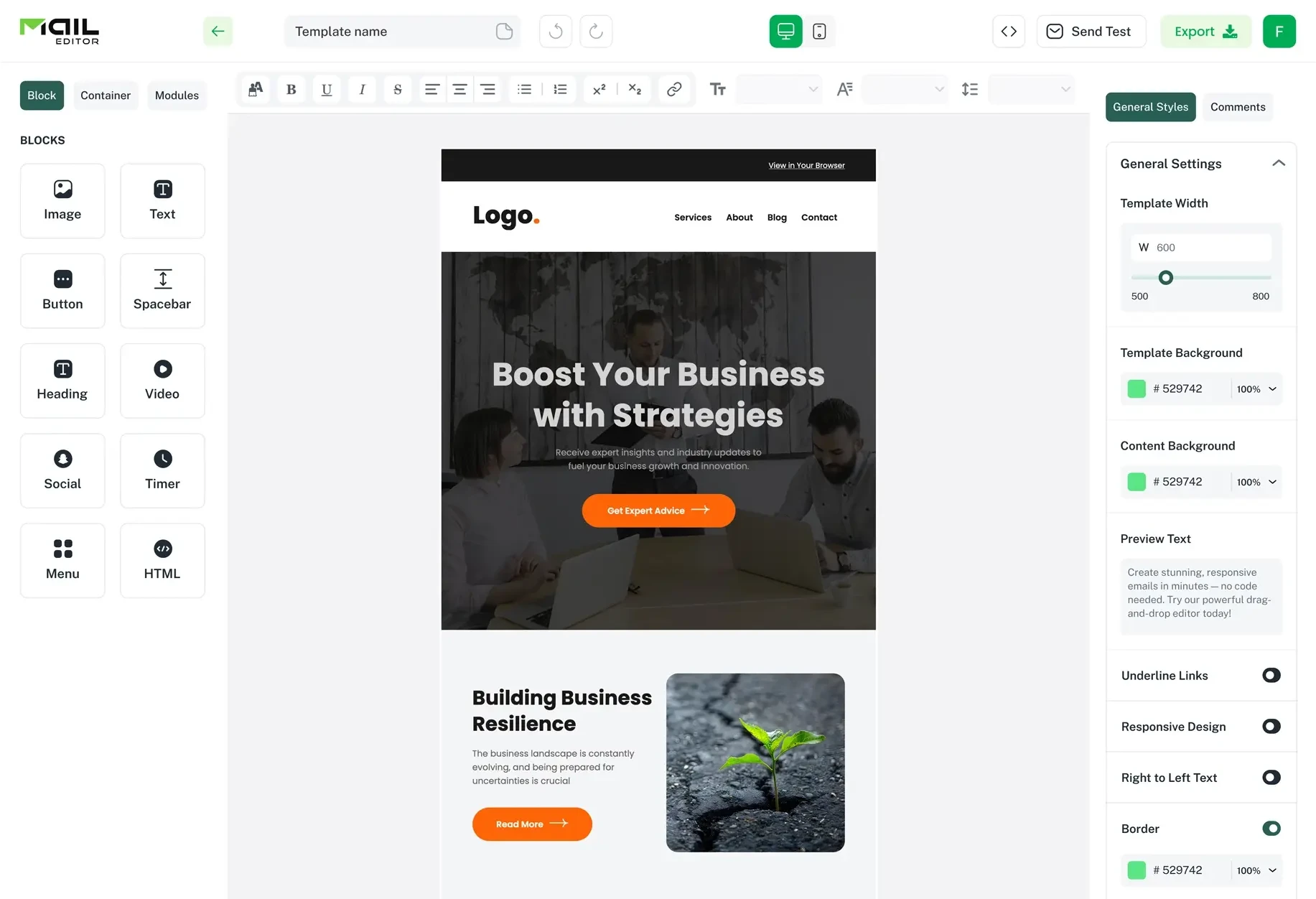
Email Design2 mins to read
Top Email Template Builders & HTML Email Editors for 2026
Compare the best email template builders and HTML editors to design professional, responsive campaigns without coding.
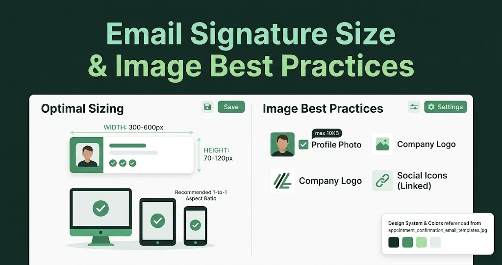
Email Design9 mins to read
Email Signature Size and Image Best Practices
The ideal email signature is 320–600px wide and 90–200px high. Learn the best image sizes, formats, file limits, and mobile-friendly design tips.

Email Tips7 mins to read
Best Drag and Drop Email Editors in 2026
Discover the best drag and drop email editors in 2026. Compare top tools, features, templates, pricing, and automation to build stunning emails fast.

Marketing7 mins to read
4 Best Unlayer Alternatives to Design Emails
Looking for Unlayer alternatives? Explore the 4 best email design tools to create beautiful, responsive emails faster and easier.

Marketing6 mins to read
5 Beefree Alternatives to Upgrade Email Design Workflows
Looking for a better email design tool? Explore 5 Beefree alternatives that streamline workflows, improve collaboration, and elevate email campaigns.