How to Test Your Email on Mobile Devices
Test your email on mobile by sending it to real phones and using preview tools, then checking layout, font size, and tap targets. See the full method

Md. Yaikub Hossain Razon
Test your email on mobile devices by sending it to real phones and checking it in a preview tool that renders across many device and client combinations. Real devices show the true result; preview tools show coverage you cannot own. Together they confirm your email is readable and tappable before you send.
Testing on mobile is not optional. More than half of all email is opened on mobile, so the mobile view is the view most recipients see first.
Follow these steps to test your email on mobile:
- Send a test to yourself and open it in the iOS Mail app and the Gmail app on Android.
- Check the subject line and preheader for truncation on a small screen.
- Confirm the layout is single-column, readable, and free of horizontal scrolling.
- Verify text is large enough to read and buttons are large enough to tap.
- Toggle dark mode on the phone and re-check contrast and readability.
- Use a preview tool to cover devices and clients you do not have.
Why test email on mobile?
Test on mobile because most opens and the harshest first impressions happen there. Litmus data puts mobile at more than half of all email opens, and Apple Mail alone accounts for roughly half the client market. If an email breaks on a phone, it breaks for the majority.
The cost of skipping the test is measurable. Research reported by Mailmodo found that around 70 percent of recipients delete a non-mobile-friendly email within seconds of opening it. Mobile readers also engage less deeply per open - Litmus's 2026 data shows a mobile click-to-open rate near 11 percent against roughly 21 percent on desktop - so a mobile email has a short window and a small screen to earn the click. Testing catches the problems that cause those deletes.
How do you test your email on mobile devices?
Test with a combination of real-device sends and a preview tool, because each covers what the other misses. There are three practical methods.
- Send to real devices. Email the exact campaign to your own iPhone and an Android phone, and open it in iOS Mail, the Gmail app, and the Outlook mobile app. This is the ground truth - the real rendering engine on a real screen - but it only covers the devices you own.
- Use a preview tool. Services such as Litmus, Email on Acid, and the free PutsMail render your email as screenshots across dozens of real device and client combinations at once, covering phones you do not have.
- Use your builder's mobile preview. Many email editors show a device-preview toggle while you design, so you can catch layout problems before you send a single test. This is a fast first check, not a substitute for a real-device open.
A builder preview is the quickest way to catch issues early. You can preview an email on mobile and desktop inside MailEditor as you build, then confirm the final version on a real phone. For coverage beyond mobile, see how to preview an email across email clients.
What should you check when testing email on mobile?
Check layout, legibility, and tappability - the three things a small screen breaks most. Work through this checklist on every mobile test.
|
Check |
What "pass" looks like |
|---|---|
|
Layout |
Single column, no horizontal scrolling, fits the screen width |
|
Body text |
Large enough to read without zooming (about 14-16px) |
|
Headlines |
Prominent and legible (roughly 22px or larger) |
|
Tap targets |
Buttons and links large enough for a thumb (see below) |
|
Subject and preheader |
Not truncated in a way that hides the message |
|
Images |
Scale to the screen, load fast, and have alt text |
|
Primary CTA |
Visible without scrolling, above the fold |
|
Dark mode |
Readable with good contrast when dark mode is on |
For tap targets, follow the platform guidelines: Apple's Human Interface Guidelines recommend a minimum touch target of 44x44 points, and Google's Material guidelines recommend at least 48x48 density-independent pixels. A button smaller than that is hard to tap accurately on a phone, which costs clicks. Designing mobile-first, covered in mobile-first email design, prevents most of these issues before testing begins.
Real device testing vs preview tools: which is better?
Use both; they answer different questions. A real device shows exactly what one recipient sees, including gestures, load speed, and dark-mode behavior, but only for the phones you own. A preview tool shows breadth - many devices and clients at once - as static screenshots, which do not capture interaction or real load time.
|
Method |
Strength |
Limit |
|---|---|---|
|
Real device |
True rendering, interaction, load speed |
Only the devices you own |
|
Preview tool |
Broad device and client coverage |
Static screenshots, no interaction |
|
Builder preview |
Instant feedback while designing |
Simulated, not a real client render |
The reliable workflow is to design with the builder preview, catch broad issues with a preview tool, and confirm the final send on at least one real iPhone and one real Android device.
How do you test email in dark mode on mobile?
Test dark mode by enabling it in your phone's system settings and reopening the email in each mail app. Dark mode is common - around 35 percent of opens occur in it - and clients apply it differently: some invert only backgrounds, others recolor text and images, which can make dark logos vanish or low-contrast text disappear.
Check that text keeps sufficient contrast, that transparent or dark-on-transparent logos remain visible (add a light outline or background if needed), and that buttons stay legible. Toggle dark mode on both iOS Mail and the Gmail app, because their dark-mode handling differs.
What common mobile email problems should testing catch?
Testing should catch the recurring failures that make an email unreadable on a phone. Watch for these:
- Fixed-width layouts that force horizontal scrolling or shrink text to fit.
- Tiny fonts that require pinch-zooming to read.
- Cramped buttons placed too close together or too small to tap accurately.
- Oversized images that slow loading or push the CTA below the fold.
- Truncated subject lines and preheaders that cut off the message in the inbox list.
- Dark-mode failures where logos disappear or text loses contrast.
- Buried CTAs that require scrolling before the reader sees the action.
FAQ
Question: How do I test my email on a mobile device?
Answer: Send the exact email to your own phone and open it in the iOS Mail app and the Gmail app, then check the layout, font size, tap targets, subject line, and dark mode. For devices you do not own, use a preview tool such as Litmus, Email on Acid, or the free PutsMail, which render the email across many phones at once.
Question: What is the best way to preview an email on mobile before sending?
Answer:The best approach combines three checks: your email builder's mobile preview while designing, a preview tool for broad device coverage, and a real-device send to confirm the final result. The builder preview catches layout issues early; the real-device open is the ground truth for what recipients see.
Question: What should I check when testing an email on mobile?
Answer:Check that the layout is single-column with no horizontal scrolling, body text is readable at about 14-16px, buttons meet the 44px minimum tap target, the subject and preheader are not truncated, images scale and load fast, the primary CTA is above the fold, and dark mode keeps good contrast.
Question: How big should email buttons be for mobile?
Answer:Make tap targets at least 44x44 points, per Apple's Human Interface Guidelines, or 48x48 density-independent pixels, per Google's Material guidelines. Add spacing around each button so a thumb cannot accidentally tap the wrong link. Buttons smaller than this are hard to tap and lose clicks on mobile.
Answer:Question: Do I need a paid tool to test email on mobile?
No. You can test for free by sending the email to your own iPhone and Android phone and opening it in each mail app, and by using free tools such as PutsMail. Paid tools like Litmus and Email on Acid add value through broad device coverage and automated checks, but real-device sends cost nothing.
Catch mobile problems before you send. Preview your email on mobile and desktop as you build it in MailEditor - see the responsive layout update live, then confirm the final version on your phone.
Popular Blogs
Email Design2 mins to read
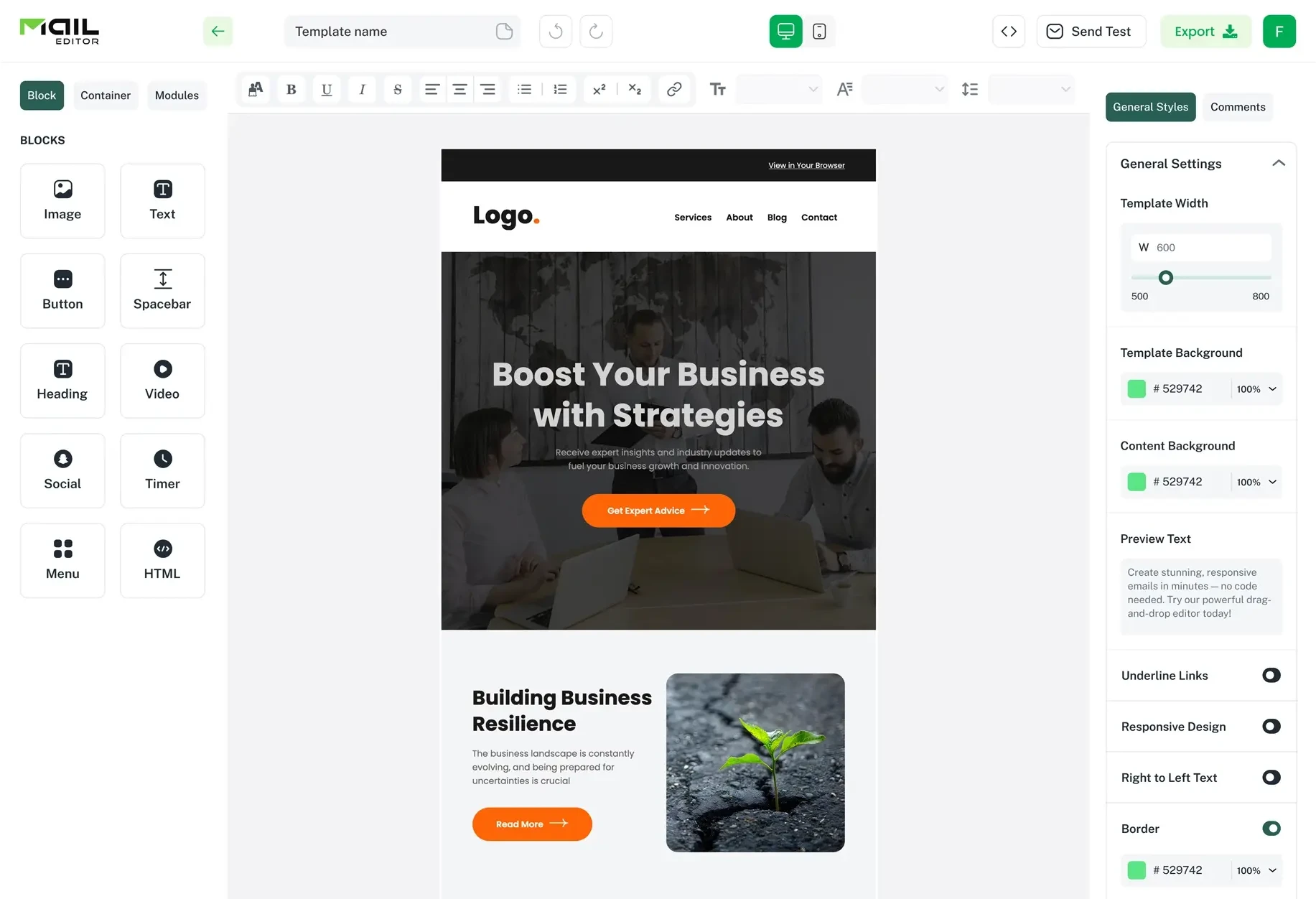
Top Email Template Builders & HTML Email Editors for 2026
Compare the best email template builders and HTML editors to design professional, responsive campaigns without coding.
Email Design9 mins to read
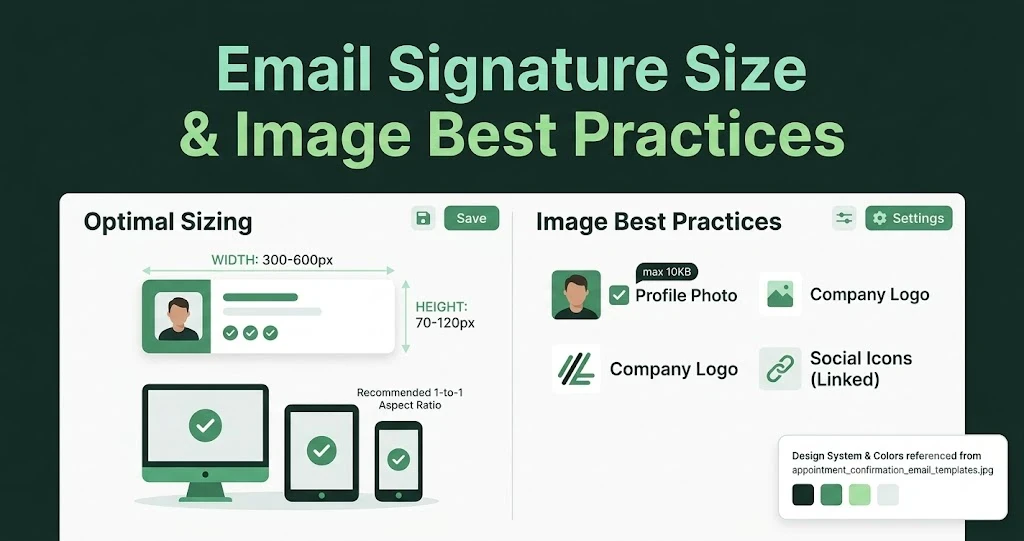
Email Signature Size and Image Best Practices
The ideal email signature is 320–600px wide and 90–200px high. Learn the best image sizes, formats, file limits, and mobile-friendly design tips.

Email Tips7 mins to read
Best Drag and Drop Email Editors in 2026
Discover the best drag and drop email editors in 2026. Compare top tools, features, templates, pricing, and automation to build stunning emails fast.

Marketing7 mins to read
4 Best Unlayer Alternatives to Design Emails
Looking for Unlayer alternatives? Explore the 4 best email design tools to create beautiful, responsive emails faster and easier.

Marketing6 mins to read
5 Beefree Alternatives to Upgrade Email Design Workflows
Looking for a better email design tool? Explore 5 Beefree alternatives that streamline workflows, improve collaboration, and elevate email campaigns.