How to Use White Space and Contrast in Email: 2026 Spacing & Contrast Rules
Learn how to use white space and contrast in email design with practical spacing rules, WCAG contrast ratios, dark mode tips, CTA sizing, and Outlook-safe techniques.

Md. Yaikub Hossain Razon
White space in email design is the deliberate empty area around and between elements, padding, margins, line height, and gutters, and contrast is the luminance difference that makes those elements readable. Used together, they decide whether a subscriber scans your email or deletes it.
Both now carry more weight than they did five years ago. Litmus Email Analytics data from July 2026, drawn from over a billion opens, puts Apple clients at 62.26% of all email opens and Gmail at 27.03%, nearly 90% of the market sits in two rendering environments that are mostly mobile. Litmus also reports that more than 25% of subscribers now read in dark mode, which changes contrast after your email leaves the ESP.
This guide is for email designers, marketers, and developers who already know how to build a template and want the numbers behind spacing and contrast decisions. You will get a reusable spacing scale, contrast ratios we measured ourselves using the WCAG relative-luminance formula, dark-mode math that most guides skip, and the Outlook-safe code to implement all of it.
What is white space in email design?
White space in email design is any area of the layout intentionally left empty, the padding inside a table cell, the margin between two content blocks, the leading between lines of text, and the gutter between columns. It does not have to be white. A cream background, a dark navy panel, or a subtle gradient all count as white space as long as no content occupies it.
Designers split white space along two axes. Both matter in email, and they solve different problems.
Macro vs. micro white space
Macro white space is the large stuff: outer margins, the gaps between major sections, the space framing a hero image. It creates the overall rhythm of the email and tells the reader where one idea ends and the next begins.
Micro white space is the small stuff: line height, letter spacing, the gap between a heading and its first paragraph, the padding inside a button. It controls how comfortable individual text is to read.
Most emails that "feel cluttered" have adequate macro spacing and starved micro spacing. Body copy set at 16px with a 17px line height looks cramped no matter how much margin surrounds the block.
Active vs. passive white space
Passive white space is structural. It separates a header from a body, or one product tile from the next. The reader never notices it, which is the point.
Active white space is persuasive. It is the extra 48px above and below your primary button that isolates the action from the argument. Isolation reads as importance. This is the Gestalt principle of proximity working in your favor: elements placed close together are perceived as related, and elements surrounded by space are perceived as separate and significant.
The practical rule: use passive white space everywhere by default, and spend active white space in one or two places per email. If everything is isolated, nothing is.
Why white space and contrast change email performance
White space and contrast improve performance by lowering the effort required to extract meaning from a screen. A subscriber scanning on a phone is deciding in a second or two whether the email is worth reading. Generous spacing and strong contrast let the hierarchy register before any words are processed.
That is the honest version of the argument. Here is the dishonest version you will find almost everywhere else.
The 20% comprehension claim does not hold up
Search "white space design" and you will repeatedly meet this sentence: white space between paragraphs and in the margins increases comprehension by almost 20%. It is usually attributed to Lin (2004), sometimes routed through Human Factors International's research reference list or Wilbert Galitz's The Essential Guide to User Interface Design.
We traced it. The underlying paper is Dyi-Yih Michael Lin's "Evaluating older adults' retention in hypertext perusal: impacts of presentation media as a function of text topology," published in Computers in Human Behavior, volume 20, issue 4 (2004). UX researcher Carl Myhill went back to the source and found that the study examined 24 older adults, aged 62 to 80, comparing retention across presentation media for Chinese-language hypertext. It was not a study of margins. It was not a study of paragraph spacing. It did not produce a general 20% comprehension figure for white space.
The claim has been laundered through secondary citation for two decades. We are flagging it because using it damages your credibility with exactly the technical readers you want, and because the real case for white space does not need it.
What actually justifies the spacing
Three arguments survive scrutiny:
- Touch accuracy. Spacing between interactive elements measurably reduces mis-taps. This is why WCAG 2.2 added a target-size criterion and why Apple and Google publish minimums.
- Legibility under real conditions. Contrast thresholds in WCAG are grounded in vision research and account for low vision, color vision deficiency, and glare. A ratio that fails on a calibrated monitor fails much harder on a phone at 30% brightness in daylight.
- Hierarchy comprehension. Proximity and isolation are how readers infer structure before reading. This is a well-established perceptual principle, independent of any single study.
The email spacing scale: exact padding values
An email spacing scale is a fixed set of pixel values used for every gap in the template, so spacing decisions become selections rather than judgments. Use a base unit of 8px, with 4px available for fine adjustments.
Here is the scale we recommend for a standard 600px email:
|
Token |
Value |
Use it for |
|---|---|---|
|
space-0 |
0px |
Resetting default <p> margins |
|
space-1 |
4px |
Icon-to-label gaps, superscript offsets |
|
space-2 |
8px |
Space between a label and its input, list item gaps |
|
space-3 |
12px |
Heading to its first paragraph |
|
space-4 |
16px |
Between paragraphs |
|
space-5 |
24px |
Left/right padding inside content blocks on mobile |
|
space-6 |
32px |
Between related blocks in the same section |
|
space-7 |
48px |
Between unrelated sections |
|
space-8 |
64px |
Above and below the primary CTA, top and bottom of the email body |
Two values do most of the work. space-6 (32px) separates related content. space-7 (48px) separates sections. If you only adopt two numbers, adopt those.
Line height and measure
Micro white space needs its own rules:
|
Element |
Font size |
Line height |
Ratio |
|---|---|---|---|
|
Body text |
16px |
24px |
1.5 |
|
Small print / footer |
13–14px |
20px |
~1.45 |
|
Subheading (H3) |
20px |
28px |
1.4 |
|
Heading (H2) |
24–28px |
32px |
~1.25 |
|
Hero headline |
32–36px |
40px |
~1.2 |
|
Button label |
16px |
20px |
1.25 |
Never set body text below 16px. Anything smaller triggers automatic text scaling in some mobile clients, which breaks your carefully planned layout in ways you did not choose.
Keep line length between 50 and 75 characters. At 16px in a common sans-serif, a 600px template with 24px side padding gives you a 552px measure, around 70 characters. That is comfortable. Wider templates without added side padding push past 90 characters and force the reader's eye to hunt for the next line.
If you are still deciding between a fixed 600px shell and a fluid one, the fixed vs. fluid email layout tradeoffs determine how much of this scale you can hold constant across viewports.
How much contrast does email text need?
Normal body text needs a contrast ratio of at least 4.5:1 against its background. Large text, 18pt (24px) regular or 14pt (about 18.7px) bold and above, needs 3:1. Non-text elements such as button borders, icons that carry meaning, and form field outlines also need 3:1 against adjacent colors.
These are the WCAG 2.2 Level AA thresholds, defined in Success Criteria 1.4.3 (Contrast Minimum) and 1.4.11 (Non-text Contrast). They did not change from WCAG 2.1. Level AAA raises the bar to 7:1 for normal text and 4.5:1 for large text.
Contrast is calculated from relative luminance, not from how different two colors look. That is why pairs that seem obviously distinct can fail.
Measured ratios for common email color pairs
We ran the WCAG relative-luminance formula on the color pairs that show up most often in email templates. Every ratio below is computed, not estimated:
|
Foreground |
Background |
Ratio |
Normal text (4.5:1) |
Large text (3:1) |
|---|---|---|---|---|
|
#333333 |
#FFFFFF |
12.63:1 |
Pass |
Pass |
|
#666666 |
#FFFFFF |
5.74:1 |
Pass |
Pass |
|
#767676 |
#FFFFFF |
4.54:1 |
Pass (barely) |
Pass |
|
#777777 |
#FFFFFF |
4.48:1 |
Fail |
Pass |
|
#999999 |
#FFFFFF |
2.85:1 |
Fail |
Fail |
|
#AAAAAA |
#FFFFFF |
2.32:1 |
Fail |
Fail |
|
#666666 |
#F5F5F5 |
5.27:1 |
Pass |
Pass |
|
#FFFFFF |
#0057FF (blue) |
5.52:1 |
Pass |
Pass |
|
#FFFFFF |
#1A73E8 (blue) |
4.51:1 |
Pass (barely) |
Pass |
|
#FFFFFF |
#FF6B35 (orange) |
2.84:1 |
Fail |
Fail |
|
#000000 |
#FF6B35 (orange) |
7.41:1 |
Pass |
Pass |
|
#FFFFFF |
#22C55E (green) |
2.28:1 |
Fail |
Fail |
|
#000000 |
#22C55E (green) |
9.22:1 |
Pass |
Pass |
|
#FFFFFF |
#15803D (dark green) |
5.02:1 |
Pass |
Pass |
Three findings worth internalizing:
#777777 fails and #767676 passes. The threshold for grey on white sits at almost exactly #767676. One hex step lighter and your body copy is non-compliant. If you use grey secondary text, #666666 gives you real headroom.
White on mid-tone brand colors is the most common button failure. White on a vivid orange measures 2.84:1 and white on a mid green measures 2.28:1. Both fail badly. The fix is not always a darker brand color, black text on that same orange measures 7.41:1 and on that same green 9.22:1. Flip the label color before you repaint the brand.
Light grey placeholder and disclaimer text almost never passes. #999999 on white is 2.85:1. Legal disclaimers, unsubscribe copy, and "view in browser" links are still text, and still need 4.5:1.
Contrast in dark mode: where safe palettes fail
Dark mode breaks contrast in emails when a client inverts the background but keeps the text color you declared. The result is dark grey text sitting on a dark grey background, at a ratio far below any accessibility threshold.
This is the failure mode that almost no email design guide quantifies. So we did.
Full inversion is not the problem
When a client inverts everything, contrast ratios survive. We inverted several common pairs and recalculated:
|
Original pair |
Original ratio |
After full inversion |
New ratio |
|---|---|---|---|
|
#333333 on #FFFFFF |
12.63:1 |
#CCCCCC on #000000 |
13.08:1 |
|
#666666 on #FFFFFF |
5.74:1 |
#999999 on #000000 |
7.37:1 |
|
#767676 on #FFFFFF |
4.54:1 |
#898989 on #000000 |
6.00:1 |
|
#0057FF on #FFFFFF |
5.52:1 |
#FFA800 on #000000 |
10.85:1 |
Ratios hold or improve. What does not survive is your brand. That blue link inverts to orange. Full inversion is a branding problem, not a legibility problem.
Partial inversion is the problem
Partial inversion happens when the client darkens backgrounds it controls but respects text colors you set explicitly. Now your declared foreground meets a background you never chose:
|
Declared text color |
Client-inverted background |
Resulting ratio |
Verdict |
|---|---|---|---|
|
#000000 |
#212121 |
1.30:1 |
Invisible |
|
#333333 |
#111111 |
1.49:1 |
Invisible |
|
#333333 |
#1A1A1A |
1.38:1 |
Invisible |
|
#666666 |
#1A1A1A |
3.03:1 |
Fails body text |
|
#0057FF |
#1A1A1A |
3.16:1 |
Fails body text |
A palette that scores a comfortable 12.63:1 in light mode collapses to 1.38:1 in a partially inverted inbox. The text is still there. Nobody can read it.
Four fixes that actually work
-
Never declare a text color without declaring its background color on the same element. If you set color:#333333 on a <td>, set background-color:#FFFFFF on that same <td>. Clients that respect one usually respect both.
-
Avoid pure #000000 and pure #FFFFFF as your base pair. Use #1A1A1A on #FFFFFF, or #111111 on #FAFAFA. Off-blacks and off-whites invert more gracefully and reduce halation on OLED screens.
-
Use prefers-color-scheme to supply a deliberate dark palette in clients that support it, so you control the dark variant instead of inheriting a machine-generated one.
-
Lighten brand colors for dark backgrounds. Our blue at #0057FF measures only 3.42:1 on #111111. Lightened to #4D8DFF, the same blue measures 5.91:1 on the same background and passes.
Test every send in both modes. Dark-mode behavior differs between Apple Mail, Gmail on Android, and Outlook, and the differences are not documented consistently by any vendor, which is why a structured mobile email testing routine matters more than any single rule in this article.
White space around CTAs: tap targets and spacing math
Give your primary button a minimum tap target of 48 × 48 CSS pixels and at least 24px of clear space on every side. That single spec satisfies every major guideline at once.
Here is what the guidelines actually require, since most email articles cite only Apple:
|
Standard |
Minimum target |
Level |
|---|---|---|
|
WCAG 2.2 SC 2.5.8 Target Size (Minimum) |
24 × 24 CSS px |
AA - required |
|
WCAG 2.2 SC 2.5.5 Target Size (Enhanced) |
44 × 44 CSS px |
AAA |
|
Apple Human Interface Guidelines |
44 × 44 pt |
Platform recommendation |
|
Google Material Design |
48 × 48 dp |
Platform recommendation |
WCAG's 24px is a floor, not a goal. It also offers a spacing alternative: an undersized target can still conform if it sits at least 24px away from every adjacent target. In email, that alternative is your safety net for stacked text links in a footer.
Translating that into button padding
A button's tap target is its content box plus its padding. To reach 48px of height with a 16px label at 20px line height:
20px line height + 14px top padding + 14px bottom padding = 48px
For the horizontal dimension, 32px of left and right padding keeps short labels like "Shop now" from looking cramped and gives longer labels room to breathe.
Recommended button spec:
|
Property |
Value |
|---|---|
|
Font size |
16px |
|
Line height |
20px |
|
Vertical padding |
14px |
|
Horizontal padding |
32px |
|
Total height |
48px |
|
Border radius |
4–8px (with a square fallback for legacy Outlook) |
|
Clear space above |
32px minimum, 48px for a primary CTA |
|
Clear space below |
32px minimum |
|
Gap to nearest other link |
24px minimum |
Active white space around the primary action
When a button is the one thing you want clicked, isolate it. Give it 48–64px above and below, and do not place a secondary link within 24px of it. In a Z-pattern or inverted-triangle layout, that isolation is what makes the button the visual terminus of the scan.
Two buttons side by side on a narrow screen is the most common mis-tap generator in email. Stack them, and put 16px between them.
Coding white space that survives Outlook and Gmail
Padding survives across email clients when you apply it to <td> elements. It does not survive reliably on <div>, <p>, or <img> in Outlook for Windows.
Outlook's classic desktop client renders HTML with Microsoft Word's engine rather than a browser engine. Word ignores or mangles a large portion of standard CSS, including margin and padding on block elements, max-width, flexbox, and grid.
Worth knowing about the timeline: Microsoft has signaled October 2026 as the end of support for the last Word-engine Outlook builds, and the new Outlook for Windows uses a Chromium-based engine instead. But Microsoft's own support documentation also indicates classic Outlook will continue receiving support into 2029 for perpetual-license and Microsoft 365 desktop customers. Treat the transition as multi-year. Litmus put Outlook desktop at 5.83% of global opens in July 2026, small overall, but far higher on B2B lists. Keep your fallbacks until your own client data says otherwise.
The rules that matter for spacing
1. Padding goes on table cells.
<table role="presentation" cellpadding="0" cellspacing="0" border="0" width="600">
<tr>
<td style="padding: 32px 24px; background-color: #FFFFFF;">
<p style="margin: 0; font-size: 16px; line-height: 24px; color: #333333;">
Content here.
</p>
</td>
</tr>
</table>
2. Reset default paragraph margins explicitly. Word applies its own margin-bottom to <p>, producing gaps you did not design. Set margin: 0 and control spacing with cell padding or an explicit bottom padding on the paragraph.
3. Force line height with mso-line-height-rule: exactly. Without it, Outlook treats your line-height as a minimum and adds its own spacing.
<p style="margin: 0; font-size: 16px; line-height: 24px; mso-line-height-rule: exactly; color: #333333;">
4. Use spacer rows, not empty cells with whitespace. An empty <td> containing only a space character collapses inconsistently. Use a row with explicit height and a non-breaking space, or a transparent GIF with display: block.
<tr>
<td height="32" style="height: 32px; line-height: 32px; font-size: 0;"> </td>
</tr>
5. Add display: block to images. Inline images inherit a baseline gap of a few pixels, which shows up as a mystery seam under every image in your email.
6. Keep Gmail's constraints in mind. Gmail strips your entire <style> block if it contains a syntax error, exceeds roughly 8,192 characters, or includes a background-image declaration. Spacing set inline is spacing that survives.
Client support summary for spacing techniques
|
Technique |
Apple Mail |
Gmail |
Outlook (classic) |
Outlook (new) |
|---|---|---|---|---|
|
Padding on <td> |
Yes |
Yes |
Yes |
Yes |
|
Padding on <div> |
Yes |
Yes |
No |
Yes |
|
Margin on <p> |
Yes |
Yes |
Unreliable |
Yes |
|
line-height |
Yes |
Yes |
Needs mso-line-height-rule |
Yes |
|
max-width |
Yes |
Yes |
No |
Yes |
|
Spacer rows |
Yes |
Yes |
Yes |
Yes |
|
Media queries |
Yes |
Partial |
No |
Partial |
The practical implication: build your spacing with table cells and inline styles, then use media queries only to enhance, never to fix something that is broken without them.
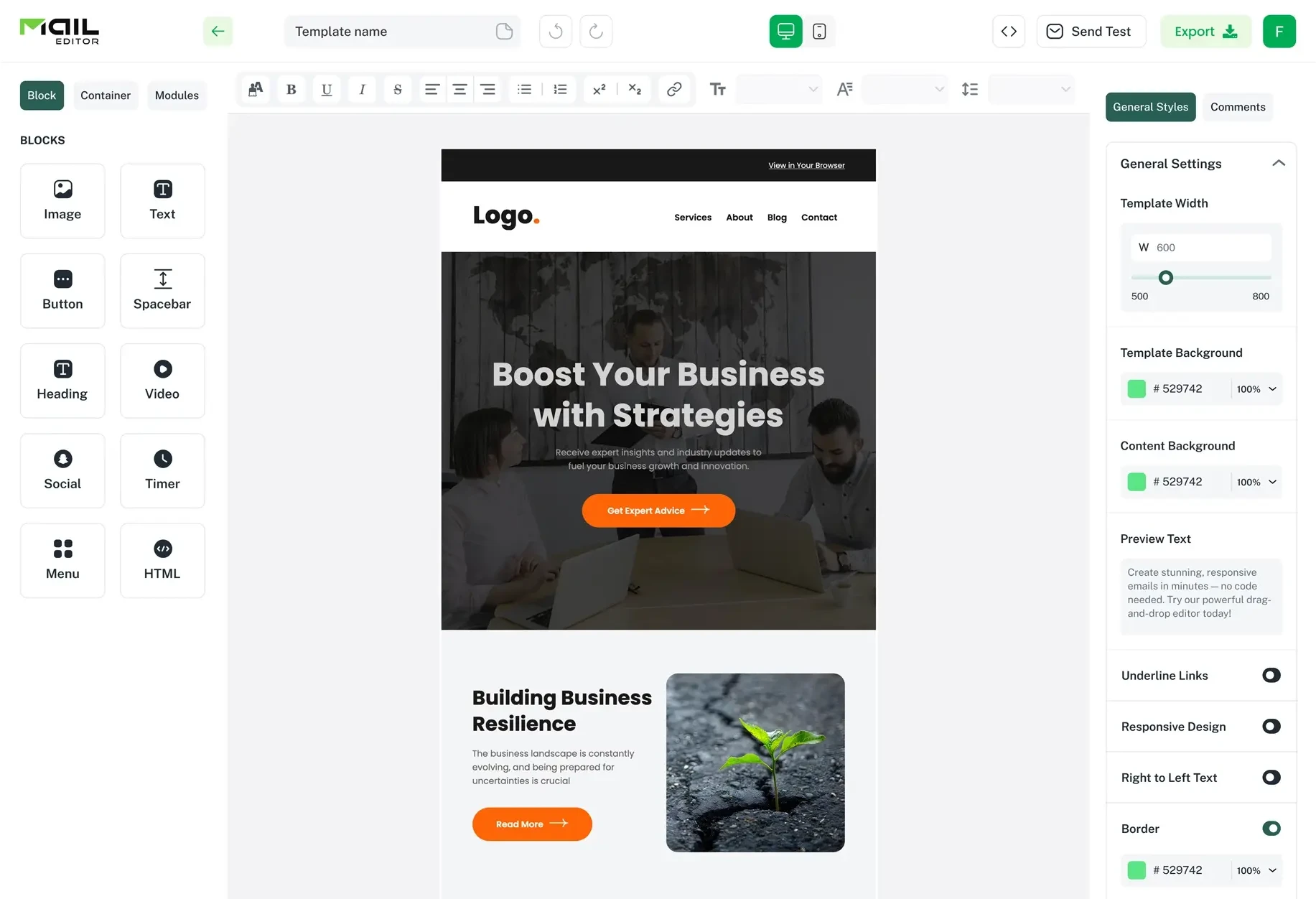
If hand-coding this is not where you want to spend your afternoon, MailEditor's drag-and-drop email builder outputs table-based, Outlook-safe padding by default, so your spacing scale survives the clients that break everyone else's.
Contrast beyond color: size, weight, and position
Contrast is not only a color property. Visual hierarchy comes from four contrast dimensions, and relying on color alone is both a design weakness and an accessibility failure.
WCAG Success Criterion 1.4.1 requires that color is never the only way meaning is conveyed. In email, that most often bites in two places: links distinguished only by color, and "sale" pricing distinguished only by red text.
The four contrast dimensions
|
Dimension |
How to apply it |
Typical range |
|---|---|---|
|
Color / luminance |
Text against background |
4.5:1 body, 3:1 large |
|
Size |
Headline vs. body |
2× minimum (32px vs. 16px) |
|
Weight |
Bold vs. regular |
400 vs. 700, skip 500/600 in email |
|
Position / space |
Isolation via white space |
48px around a focal element |
A headline at 32px bold on a well-spaced block is doing three of the four. That redundancy is what makes hierarchy readable when images are blocked, when a client overrides your fonts, or when a subscriber has a color vision deficiency.
Practical rules
-
Underline links in body copy. Color alone is not sufficient signaling. This is a one-line fix that resolves a genuine accessibility failure.
-
Pair color coding with a symbol or label. Strikethrough plus "was $89" beats red text alone.
-
Do not use font weights between 400 and 700. Many email clients lack the intermediate weights and substitute unpredictably, which flattens the contrast you designed. Font behavior varies enough across clients that web font support in email is worth checking before you commit to a type scale.
-
Give one element per screenful the strongest contrast. If three things shout, none does.
The preview pane budget: white space vs. above the fold
Generous white space and a visible CTA compete for the same vertical pixels. On a typical phone, you have roughly 450 CSS pixels of email visible before the first scroll, after the client's own header, subject line, and sender row consume the rest of a 667px viewport.
That is a budget. Here is what happens when you spend it without planning.
Layout A: spacing applied by feel (button falls below the fold):
|
Element |
Height |
Running total |
|---|---|---|
|
Top padding |
24px |
24px |
|
Logo |
40px |
64px |
|
Space |
32px |
96px |
|
Hero image (600×300, scaled to 375px width) |
187px |
283px |
|
Space |
24px |
307px |
|
Headline, 2 lines @ 32px |
64px |
371px |
|
Space |
12px |
383px |
|
Body copy, 2 lines @ 24px |
48px |
431px |
|
Space |
24px |
455px |
|
Button (48px) |
48px |
503px - below the fold |
Layout B: same content, budgeted spacing (button visible):
|
Element |
Height |
Running total |
|---|---|---|
|
Top padding |
20px |
20px |
|
Logo |
32px |
52px |
|
Space |
24px |
76px |
|
Hero image (600×240, scaled to 375px width) |
150px |
226px |
|
Space |
20px |
246px |
|
Headline, 2 lines @ 30px |
60px |
306px |
|
Space |
12px |
318px |
|
Body copy, 2 lines @ 24px |
48px |
366px |
|
Space |
24px |
390px |
|
Button (48px) |
48px |
438px - visible |
The difference is 65 pixels, and none of it came from cramming content. It came from a shorter hero crop and trimming four spacing values by 4–8px each. The email still breathes. The button is still isolated by 24px. It is simply visible.
The method: list your above-the-fold elements, assign heights, total them, and compare against 450px. If you are over, shorten the hero before you shrink the spacing. Hero images are almost always the cheapest 40 pixels in the budget.
Then go the other way below the fold. Once the reader has scrolled, they have committed. Spend space-7 and space-8 freely.
Common white space and contrast mistakes
-
Padding on <div> instead of <td>. Looks perfect in your browser preview. Collapses in Outlook desktop.
-
Body text below 16px. Triggers automatic scaling on mobile and breaks your layout without warning.
-
Grey-on-grey secondary text. #999999 on #F5F5F5 is barely visible and fails AA by a wide margin.
-
White labels on mid-tone brand buttons. The single most frequent AA failure in commercial email.
-
Declaring text color without background color. The direct cause of dark-mode disappearance.
-
Two buttons side by side on mobile. Guarantees mis-taps regardless of individual target size.
-
Uniform spacing everywhere. If every gap is 24px, the reader gets no grouping information at all. Vary spacing to signal relationships.
-
Spacing that only exists in a media query. Outlook classic ignores media queries entirely. The un-enhanced version must already be correct.
-
Assuming white space hurts deliverability. It does not. Spam filters evaluate authentication, sending reputation, and engagement, not your padding values.
-
Testing in one client. Apple and Gmail behave differently from each other, and both behave differently in dark mode.
How to audit your email in 10 minutes
Run this before every send. It catches the majority of spacing and contrast failures.
- Open the design at 375px wide. Not your desktop preview. Most of your audience is here.
- Check every text color against its background with a contrast checker such as WebAIM's. Body text must clear 4.5:1. Large text and non-text elements must clear 3:1.
- Check the button label against the button fill, then check the button fill against the email background. Both need to pass. Most audits skip the second check.
- Measure your primary button. It should be at least 48px tall with 24px of clear space on all sides.
- Confirm every text element has an explicit background color declared on the same element. This is your dark-mode insurance.
- View in dark mode on an actual device, in both Apple Mail and Gmail. Look for text that has vanished and brand colors that have shifted hue.
- Total your above-the-fold heights against a 450px budget. Confirm the primary CTA lands inside it.
- Squint at the email, or blur it. The elements still visible are your hierarchy. If the button is not one of them, it needs more isolation or more contrast.
- Turn images off. Confirm the layout still holds and the spacing does not collapse. Alt text should sit at a readable contrast too.
- Send a live test to Outlook desktop if your list has any B2B share. Look specifically for collapsed padding and unexpected gaps beneath images.
Frequently asked questions
Question: How much white space should an email have?
Answer: Use an 8-point scale: 16px between paragraphs, 32px between related blocks, and 48px between unrelated sections. Body text should have a 24px line height at 16px font size. Above the fold, budget your total element heights against roughly 450 visible pixels so the primary CTA stays in view.
Question: What contrast ratio do email buttons need?
Answer: Button labels need at least 4.5:1 against the button fill, and 3:1 for text at 18pt (24px) and above. The button fill itself needs 3:1 against the email background so the button's edge is distinguishable. Check both. White on a mid-tone orange measures around 2.84:1 and fails, while black on the same orange measures 7.41:1 and passes.
Question: Does white space affect email deliverability?
Answer: No. Spam filtering is driven by authentication (SPF, DKIM, DMARC), sending reputation, list quality, and engagement signals. Padding and margins are not evaluated. The one indirect link is that a cluttered, hard-to-read email tends to produce weaker engagement, and engagement does influence inbox placement over time.
Question: Why does my email spacing break in Outlook?
Answer: Outlook for Windows classic renders email with Microsoft Word's engine rather than a browser engine. Word ignores padding on <div> elements, applies its own margins to <p>, treats line-height as a minimum rather than an exact value, and does not support max-width or media queries. Apply padding to <td> elements, reset paragraph margins to zero, and add mso-line-height-rule: exactly.
Question: Should I use pure white backgrounds in email?
Prefer an off-white such as #FAFAFA or #FFFFFF paired with off-black #1A1A1A text rather than pure #000000. Off-blacks reduce halation on OLED screens and behave more predictably when a client generates a dark variant. Pure white backgrounds are fine; pure black text on pure white is the pairing worth softening.
Question: How do I add white space without breaking dark mode?
Answer: White space itself is safe - empty space has no color to invert. The risk is the background color of the cell containing that space. Declare background-color on every <td> that also carries a text color, use prefers-color-scheme to define a deliberate dark palette, and lighten brand colors for dark backgrounds. A blue at #0057FF measures 3.42:1 on #111111 and fails; lightened to #4D8DFF it measures 5.91:1 and passes.
Question: Is more white space always better in email?
Answer: No. White space above the fold competes directly with CTA visibility, and uniform spacing everywhere removes the grouping information readers use to infer structure. Vary your spacing so it signals relationships, tight gaps for related items, wide gaps for section breaks, and reserve the largest spacing for the one element you most want clicked.
Question: What is the minimum tap target size for an email button?
Answer: WCAG 2.2 Success Criterion 2.5.8 requires 24 × 24 CSS pixels at Level AA, with an alternative for smaller targets that have 24px of spacing around them. Apple recommends 44 × 44 points and Google Material recommends 48 × 48 dp. Building at 48px tall with 24px of clear space satisfies all three.
Popular Blogs
Email Design2 mins to read
Top Email Template Builders & HTML Email Editors for 2026
Compare the best email template builders and HTML editors to design professional, responsive campaigns without coding.

Email Tips7 mins to read
Best Drag and Drop Email Editors in 2026
Discover the best drag and drop email editors in 2026. Compare top tools, features, templates, pricing, and automation to build stunning emails fast.
Email Design9 mins to read
Email Signature Size and Image Best Practices
The ideal email signature is 320–600px wide and 90–200px high. Learn the best image sizes, formats, file limits, and mobile-friendly design tips.

Marketing7 mins to read
4 Best Unlayer Alternatives to Design Emails
Looking for Unlayer alternatives? Explore the 4 best email design tools to create beautiful, responsive emails faster and easier.

Marketing6 mins to read
5 Beefree Alternatives to Upgrade Email Design Workflows
Looking for a better email design tool? Explore 5 Beefree alternatives that streamline workflows, improve collaboration, and elevate email campaigns.
